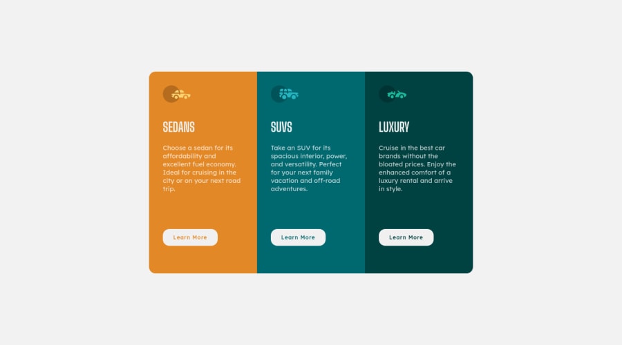
Design comparison
Solution retrospective
Any Feedback will be appreciated.
Community feedback
- @NomiDomiPosted almost 3 years ago
Hey @Naveed89-tech,
Really great job! You seem to have a really good understanding of the different types of units one can use in CSS.
The only suggestion I could give is to create CSS variables in the :root selector and use them for cleaner code.
Check this out in case you haven't use them before.
Hope this helps! Keep coding! :)
Marked as helpful1@Naveed89-techPosted almost 3 years ago@NomiDomi Thanks for the valuable feedback. In the next project, I will do this.😇
1 - @skyv26Posted almost 3 years ago
Hello! Naveed, Your Desktop design is ok.
But your mobile response designs are not ok. You can see that in mobile width design your design touches even going outside the mobile viewport (Vertically).
Fix it ASAP.
Good Luck
Marked as helpful0@Naveed89-techPosted almost 3 years ago@skyv26 Currently updated, thanks for your timely feedback.
1 - @Naveed89-techPosted almost 3 years ago
Thank u so much.
1
Please log in to post a comment
Log in with GitHubJoin our Discord community
Join thousands of Frontend Mentor community members taking the challenges, sharing resources, helping each other, and chatting about all things front-end!
Join our Discord
