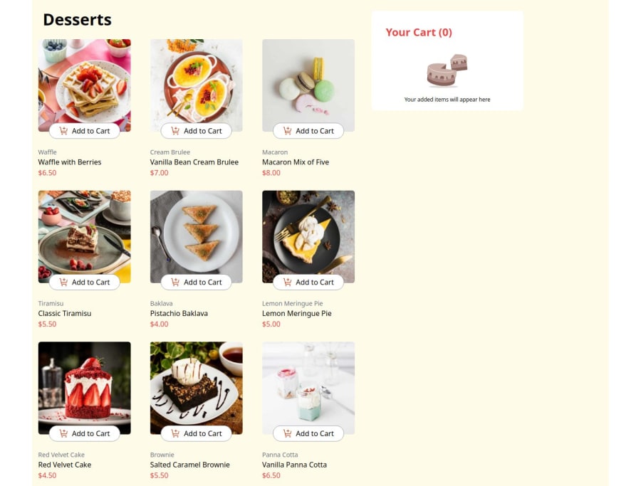
This was built using tailwind CSS , React {useState}, {useEffect}.....
Design comparison
Solution retrospective
Well just proud i did went harder than the last time, and probably would go even harder next time
What challenges did you encounter, and how did you overcome them?the toggle part was one of the hardest part for me because i am still new but somehow i did went pass it, follow by managing the useState, i know i need to improve more on this aspect just a very slow process for me.
What specific areas of your project would you like help with?managing useState and creating toggles to pop out a content
Community feedback
- P@ValsCodesPosted 7 months ago
Great work! Very impressive work with the Javascript
Here are some ideas to look into
- the elephant in the room, the background color
- the mobile confirmation page can use some tweaking in terms of the margin/ padding
- a little size up on everything would get you closer to the design
- don't forget sematic HTML tags, add a simple role="main" to your outest divs
- take your time to get closer to the desired topography, it is supposed to have heavier font-weight at some places
Great work over all!
0@Provee510Posted 6 months agoThank you so much for the head's up i sure will put that into work @ValsCodes
0
Please log in to post a comment
Log in with GitHubJoin our Discord community
Join thousands of Frontend Mentor community members taking the challenges, sharing resources, helping each other, and chatting about all things front-end!
Join our Discord
