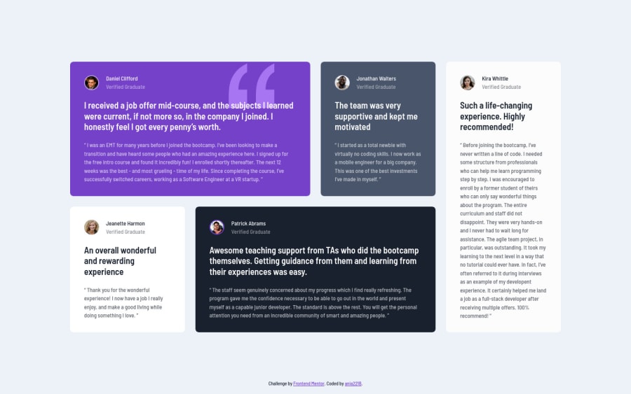
Testimonials grid section with grid areas, custom properties & flexbox
Design comparison
Community feedback
- @correlucasPosted over 2 years ago
👾Hello @ania221B, congratulations on your new solution!
Your html is working but you can improve it using meaningful tags and replace the divs, for example the main div that takes all the content can be wrapped with
<main>or section, about the cards you can replace the<div>that wraps each card with<article>you can wrap the paragraph with the quote with the tag<blockquote>this way you'll wrap each block of element with the best tag in this situation. Note that<div>is only a block element without meaning, prefer to use it for small blocks of content.This article from Freecodecamp explains the main HTML semantic TAGS: https://www.freecodecamp.org/news/semantic-html5-elements/
✌️ I hope this helps you and happy coding!
Marked as helpful0P@ania221BPosted over 2 years agoHello @correlucas!
Thank you very much for the feedback and the article😊 You're right, there were too many
<div>elements and I decided to replace some of them with<header>,<figure>&<figcaption>and get rid of some altogether. I hope it's better now.Thank you again and have a great day😊
1
Please log in to post a comment
Log in with GitHubJoin our Discord community
Join thousands of Frontend Mentor community members taking the challenges, sharing resources, helping each other, and chatting about all things front-end!
Join our Discord
