Submitted about 1 month ago
Testimonials grid section solution
#tailwind-css

@PaiKai-Lee

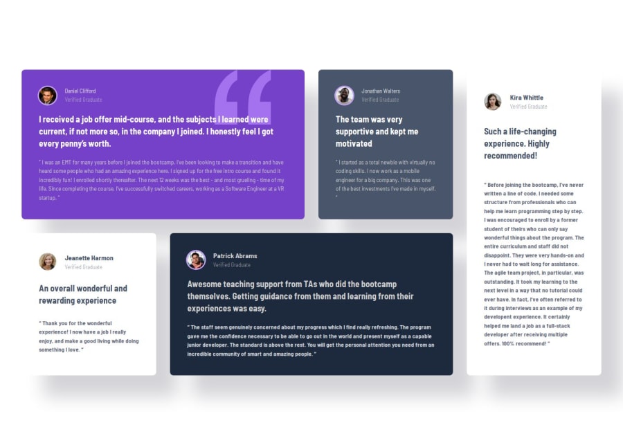
Design comparison
SolutionDesign

Community feedback
- P@vanrucPosted about 1 month ago
Hi Pai,
Nice to have some comment on your solution.
- Firstly, as our design the body of the page will have background color : #F6F5F6, by adding background color you will see your card easier(currently as you see, white background card look shorter than other block)
- Secondly, you may review the font size, font weight of each card text content.
- Thirdly, not all of image has ring, please double check.
- Lastly, you may try to implement style for tablet to match with the design.
Hope this help, Ruc
Marked as helpful0

Please log in to post a comment
Log in with GitHubJoin our Discord community
Join thousands of Frontend Mentor community members taking the challenges, sharing resources, helping each other, and chatting about all things front-end!
Join our Discord