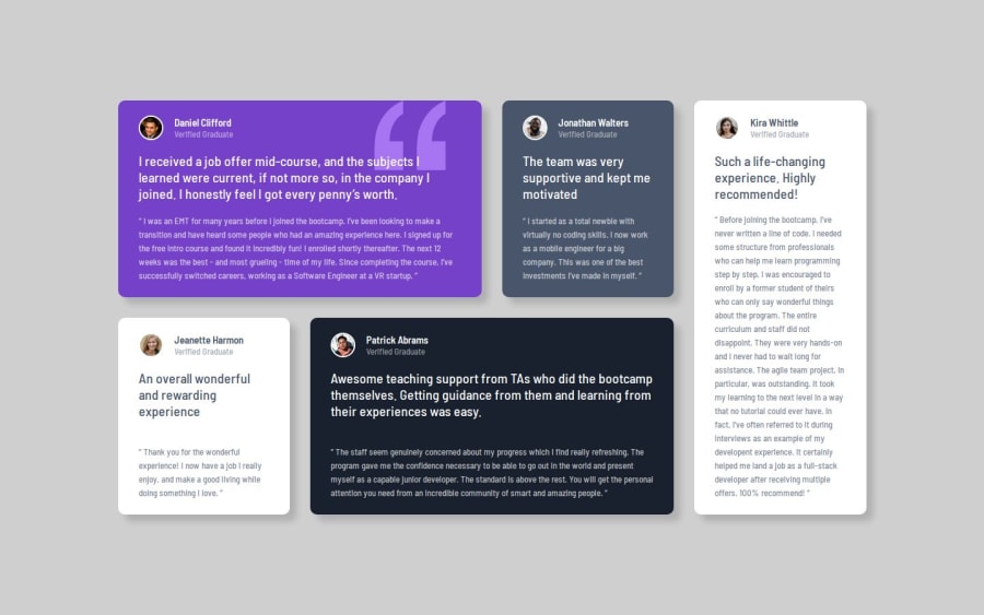
Design comparison
Solution retrospective
This was my first real time using grid so i was really proud of the outcome and how it boxes move with the different sizing.
What challenges did you encounter, and how did you overcome them?I struggled to figure out how to make the grid responsive and how to make each box the correct height (only taking up as much space as it needs) when in the slimmer viewports.
What specific areas of your project would you like help with?To know if i've done the responsive aspects as efficiently as they could be.
Community feedback
- @BoffdubPosted 4 months ago
Nice work!
The thing that stands out though is the background color is different. But that's not a big deal.
0
Please log in to post a comment
Log in with GitHubJoin our Discord community
Join thousands of Frontend Mentor community members taking the challenges, sharing resources, helping each other, and chatting about all things front-end!
Join our Discord
