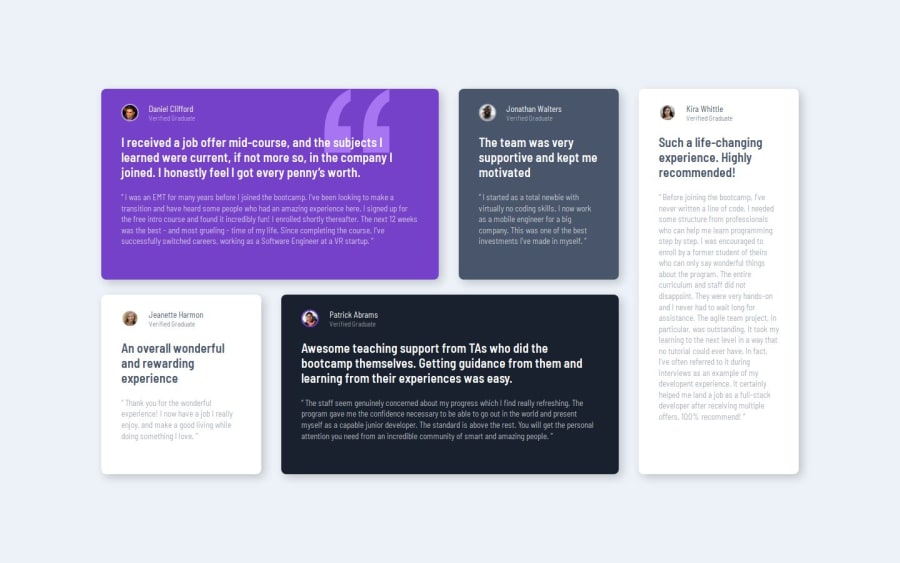
Design comparison
Solution retrospective
I'm proud of sticking through this challenge and getting better at web-layouting
What challenges did you encounter, and how did you overcome them?During the fundamental work i encountered the problem that the second column's height didn't match the height of the first column with the 2 rows in it.
I overcame this issue by deleting my existing layout and starting over from scretch with a much simpler approach.
What specific areas of your project would you like help with?For the mobile version below 600px display width:
How can i make the container of the cards match the new content height of the cards ? bcs right now the cards just overflow from and therefore i can't put a spacing on the end of the cards-container in mobile.
I'd really appreciate help on this behalf if you happen to know the issue :D
Community feedback
- @hitmorecodePosted 4 months ago
Nice well done it looks good, but I think the main goal of this exercise is to make you familiar with CSS grid. I see that you created this page with flexbox, try and do the same but using CSS grid.
Keep it up 👍👌
2 - @hannibal1631Posted 4 months ago
Well buddy,
@media (max-width: 600px) { .container { flex-direction: column; overflow: visible; max-height: 100svh; padding: 5.23rem; } }this is where you screwed up that no-space problem. Instead of 100svh, use 100% and use margin-y to give it space above and below.Hope that helped. And if i may, learn tailwind. You won't face this silly yet time consuming problems. Happy Coding.
0
Please log in to post a comment
Log in with GitHubJoin our Discord community
Join thousands of Frontend Mentor community members taking the challenges, sharing resources, helping each other, and chatting about all things front-end!
Join our Discord
