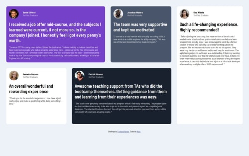
Submitted over 1 year agoA solution to the Testimonials grid section challenge
Testimonials-grid-section
@Mageshwari-Balaguru

Solution retrospective
What are you most proud of, and what would you do differently next time?
This layout took me around 6 hours. Next time will try to reduce the time. also try to use some CSS methodologies like BEM. I just recently come to know there were some methodologies is there which will make our code more readable, understandable.
What specific areas of your project would you like help with?In the flex container, .items-container the paragraph text which is in speech class was not occupy the whole size. i tried max-width to fit-content - won't work, so deleted that.
Code
Loading...
Please log in to post a comment
Log in with GitHubCommunity feedback
No feedback yet. Be the first to give feedback on Mageshwari Balaguru's solution.
Join our Discord community
Join thousands of Frontend Mentor community members taking the challenges, sharing resources, helping each other, and chatting about all things front-end!
Join our Discord