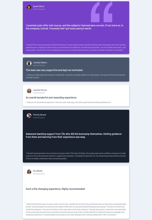
Not Found
Not Found
Not Found
Not Found
Not Found
Not Found
Not Found
Not Found
Not Found
Not Found
Not Found
Not Found
Not Found
Not Found
Not Found
Not Found
Not Found
Not Found
Not Found
Not Found

Submitted

Testimonials Grid

Niels 140

@nielsfechtel

Desktop design screenshot for the Testimonials grid section coding challenge

This is a solution for...

  • HTML
  • CSS
2junior
View challenge

Design comparison


SolutionDesign

Solution retrospective


What challenges did you encounter, and how did you overcome them?

Had some trouble with Grid, maybe should have used Flexbox. Check the readme for details.

Community feedback

@krushnasinnarkar

Posted

Hi @nielsfechtel,

Congratulations on successfully completing the challenge!

I noticed you're facing issues with your grid layout. To help you out, I recommend checking out some documentation on CSS Grid. Here are two great resources to get you started:

These resources will help you understand how the grid works and how to implement it effectively.

Additionally, you can check out my solution to see how I used the grid layout: My Testimonials grid section Solution

I hope you find this helpful.

Feel free to reach out if you have more questions or need further assistance.

Happy coding!

Marked as helpful

2

@damigand

Posted

I think you have the wrong idea about handling your elements with grid. You need to establish the amount of rows and columns in your grid element using the properties grid-template-rows and grid-template-columns. For this project, looking at the challenge screenshot, it makes sense for our grid to be two rows tall and four columns wide. The first element (Daniel) takes two columns of the first row. The second element (Jonathan) takes one column of the first row. And so on with the rest of them. To make each individual card element take its corresponding space, we can make use of the grid-row and grid-column properties in the card element itself. For example, we have the given grid parent:

.grid {
  display: grid;
  grid-template-rows: 350px 350px */ two rows of 350px each */
  grid-template-columns: repeat(4, 1fr) /* four columns, each column taking the same space as the rest */
}

Then you'll have daniel's card like this:

#daniel {
  grid-row: 1 / 2;
  grid-column: 1 / 3;
}

To understand why we're using these values, we need to go through how grid works. If a grid layout has 2 rows, then our grid has 3 lines dividing it from top to bottom (you can see these lines by enabling the grid layout in your browser elements tab). So, if we want our #daniel element to take space only in our first row, we need to tell him from which line to which he can extend. The first row goes from line 1 to 2, and the second row goes from line 2 to 3, so the property is grid-row: 1 / 2;. We apply the same logic for columns. If our grid layout has 4 columns, there are 5 lines dividing them. First column goes from line 1 to 2, second column goes from line 2 to 3, and so on. Since we want #daniel to take the first two columns worth of space, our value is grid-column: 1 / 3. Keep in mind that the layout will look really odd until you're done establishing the grid-row and grid-column properties for the rest of the card elements.

To rearrange the spacing, you can simply use a media query and change all of these properties to reorganize the layout of the page to make it fit better in different screen sizes. This includes changing the grid rows and columns, as well as the grid-row and grid-column properties in the cards.

If my explanation was helpful, please consider marking it as such. If I didn't clear it up enough for you, feel free to respond and I'll get back to you as soon as possible.

These things take a bit of trial and error at first, so don't be discouraged. Keep working!

Marked as helpful

1

Niels 140

@nielsfechtel

Posted

@damigand I did this - the two rows and four columns, including the placing of the elements - did you look at the code/live site? The screenshot is odd. The site definitely isn't very responsive, but on a normal desktop monitor, the grid looks good. Thank you for your extensive comment!

0

@damigand

Posted

@nielsfechtel I see what you mean. I looked at it from my laptop and I guess my screen width was narrow enough to not have the grid at all. What do you mean by "The site definitely isn't very responsive"? As long as it's visible in most screen widths, it's pretty responsive! I would say the only thing that's not responsive is the very last card, because it has height: 500px in one of the media queries. You should be fine with that one change.

You can also try changing the main element from display: grid to display: flex. You would have to center the elements with align-items: center and use width: 90% on the .card element. This will make it more responsive across all the media query widths.

Marked as helpful

1

Please log in to post a comment

Log in with GitHub
Discord logo

Join our Discord community

Join thousands of Frontend Mentor community members taking the challenges, sharing resources, helping each other, and chatting about all things front-end!

Join our Discord