Design comparison
SolutionDesign
Solution retrospective
Please let me know if I made any mistakes or something I can improve.
Community feedback
- @dewslysePosted over 3 years ago
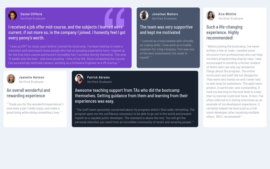
Hello Kasia 👋! Your page looks very nice and is responsive across devices. Well done 👏👏👏.
If it matters to you, you could vertically align your content to the center of the page and also add the shadows to the individual cards, just like in the design.
All the best.
Marked as helpful0
Please log in to post a comment
Log in with GitHubJoin our Discord community
Join thousands of Frontend Mentor community members taking the challenges, sharing resources, helping each other, and chatting about all things front-end!
Join our Discord
