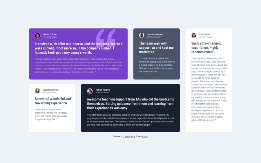
Design comparison
Solution retrospective
I really liked to work with grid, it really helps with responsiveness.
I played a little bit with media queries and thanks to relative units I only needed two breakpoint.
What challenges did you encounter, and how did you overcome them?Everything went pretty smoothly.
I've loose a bit of time figuring out the color as they weren't all specified in the style-guide file, the Figma file helped and also the color picker from the devtool it's great.
SVG is also something that I'm discovering. In this project I converted the SVG file in CSS (https://www.svgbackgrounds.com/tools/svg-to-css/) and use it as back-ground image, and then positioning it where it was suppose to be. I'd like to learn more about svg... any recommendation?
What specific areas of your project would you like help with?I'd like to learn more about svg... any recommendation?
Also please fill free to leave a feedback on the HTML and CSS code, organization, readability.
Thanks😎
Join our Discord community
Join thousands of Frontend Mentor community members taking the challenges, sharing resources, helping each other, and chatting about all things front-end!
Join our Discord
