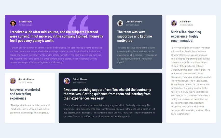
Design comparison
Solution retrospective
First time really using CSS Grid, I'd probably use it more often now. I think it came out pretty well. I would start with mobile first next time. Struggling with that currently.
What challenges did you encounter, and how did you overcome them?I'm struggling with a starting point with mobile. When the project is mobile and desktop only, looking for some best practices to start and then when it transitions into the next size not have it look so wonky. I haven't overcome this yet, but I'd love to figure it out.
What specific areas of your project would you like help with?I'm struggling with a starting point with mobile. When the project is mobile and desktop only, looking for some best practices to start and then when it transitions into the next size not have it look so wonky. I haven't overcome this yet, but I'd love to figure it out.
Community feedback
- @gitVikas898Posted 5 months ago
hey Julie your solution looks good , and yes I agree grids are good and should be used more often , with that thing whether to choose mobile or desktop first , I would say from a personal exp , give yourself more time and keep practicing here with each challenge you'll get better and eventually you will know which one to choose first!
0
Please log in to post a comment
Log in with GitHubJoin our Discord community
Join thousands of Frontend Mentor community members taking the challenges, sharing resources, helping each other, and chatting about all things front-end!
Join our Discord
