Design comparison
SolutionDesign
Solution retrospective
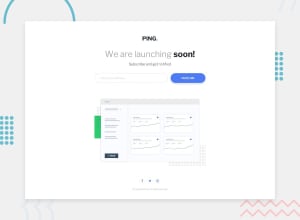
I just have learned this framework and I practice that with this project ^^ Do you see any problem with my page, any feedback are welcome
Community feedback
- @tedikoPosted over 3 years ago
Hello, Tin.Pham! 👋 Congrats on finishing another challenge! Your solution looks very good and also responds well. Here's my few tips:
- Change the
altattributes for the dashboard-image, as it doesn't add any extra context for screen reader users. Since your image is decorative youralttext should be provided empty (alt="") so that they can be ignored by assistive technologies. - Wrap your icons into some anchor elements
<a>. Remember to addaria-labelwith a description to it since icons are treated as if there was no content there.
Good luck with that, have fun coding! 💪
1 - Change the
- @palgrammingPosted over 3 years ago
looks pretty close to the design. you need a little more space around the top and bottom of the main hero img. Also the circles around your social icons to not to look to be the correct color and they are currently lacking the hover effect
1
Please log in to post a comment
Log in with GitHubJoin our Discord community
Join thousands of Frontend Mentor community members taking the challenges, sharing resources, helping each other, and chatting about all things front-end!
Join our Discord
