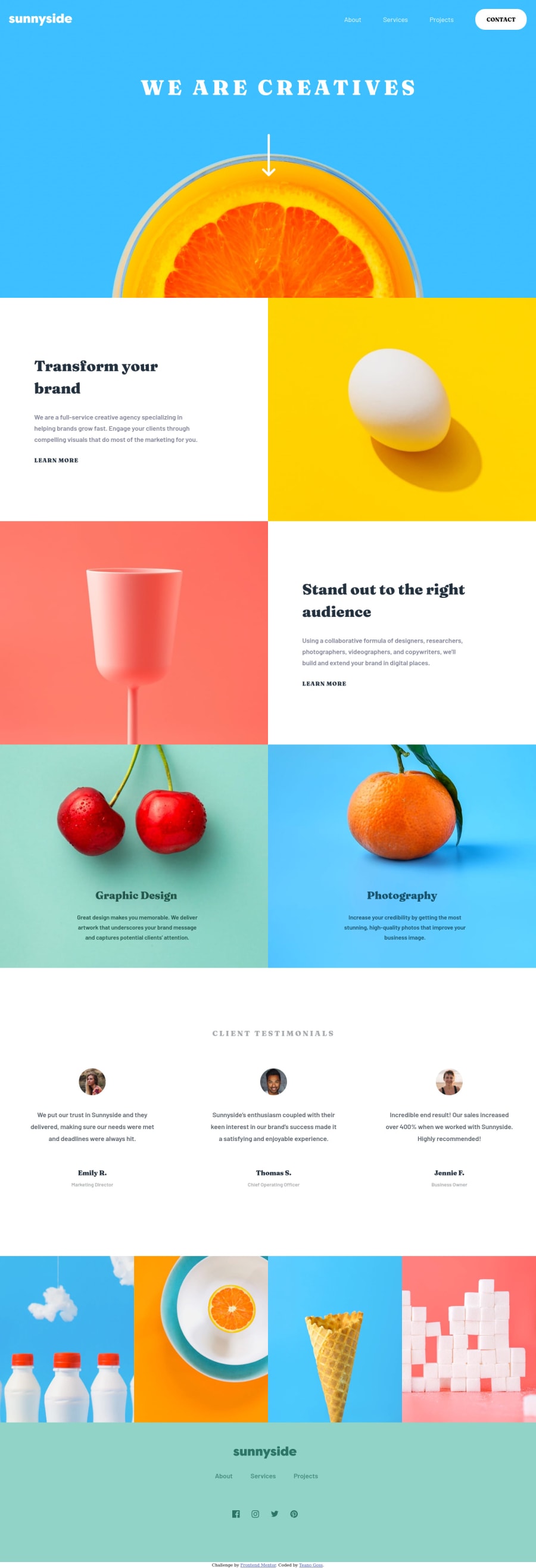
Sunnyside Agency Landing Page Using Flex-box and CSS Grid
Design comparison
Solution retrospective
Wasn't sure how to get the underlines below my "learn more" links to offset right without disappearing. If anyone could lend me a hand I would deeply appreciate it. This was my first time trying to master flex-box and CSS Grid specifically grid-template-areas because they are awesome!
Community feedback
- @eklemisPosted over 3 years ago
Hi Teano Goss,
I see you utilize text-underline to make it. Other than that you can use
::afteror::beforepseudocode to get that result as well. You can google it, there must be many resources explaining the topic.Marked as helpful1P@tcaturani-gossPosted over 3 years ago@eklemis I appreciate you so much for commenting on my solution! I tried : :after and for some reason the underline would disappear if my text-underline-offset went over -0.3em and I am looking to hit at least -0.4em or -0.5em. I did not think about using : :before so I am definitely going to use that pseudo-class and see if that works. Again thank you so much for taking the time to comment on my solution.
0@eklemisPosted over 3 years ago@tcaturani-goss Have you tried making the
.learn-more-one {position relative;}and.learn-more-one::after{position: absolute}? Also you have to set the width and height of the.learn-more-one::afterin order for it to be seen.Marked as helpful1P@tcaturani-gossPosted about 3 years ago@eklemis Sorry for taking so long to get back to you! I am on a deep dive of sharpening my JavaScript skills and put this one on the back burner for a bit. Thankfully I finally fixed the underline issue by putting a
<span>around the learn more text in my.learn-moreanchors. Then using the class.learn-more-one span { background: linear gradient(hsl(49, 66%, 83%), hsl(49, 66%, 83%)) 0 110% / 100% 8px no-repeat; border-radius: 30px; padding: 0rem 0.5rem; }to position the underline behind the text.1 - @anoshaahmedPosted over 3 years ago
To get rid of the accessibility/HTML issues shown in your Report:
- wrap everything in your body in
<main>OR use semantic tags OR giverole=""to the direct children of your<body>... Click here to read more <section>and<article>usually need a heading; so if you don't need a heading in it, use some other element such as<div><a>should have anaria-label... Click here to read more
Good job! :)
Marked as helpful1P@tcaturani-gossPosted over 3 years ago@anoshaahmed You are phenomenal! Thank you so much for the helpful feedback and for taking the time to comment on my solution!
1 - wrap everything in your body in
Please log in to post a comment
Log in with GitHubJoin our Discord community
Join thousands of Frontend Mentor community members taking the challenges, sharing resources, helping each other, and chatting about all things front-end!
Join our Discord
