Submitted almost 3 years ago
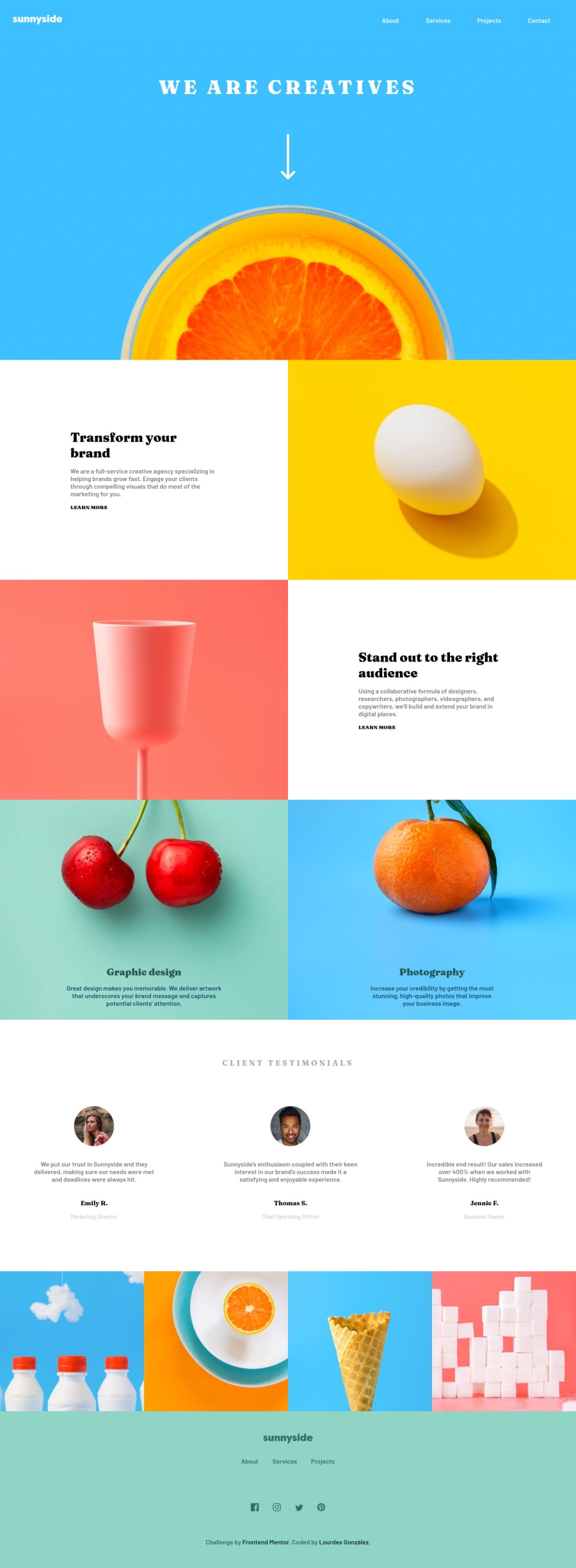
Sunnyside agency landing page using CSS: grid, Flexbox and JavaScript
@Lourdes84
Design comparison
SolutionDesign
Solution retrospective
Hello world! This is my solution frontMentor challenge: Sunnyside landing page. If someone wants to give me a recommendation to improve the code, feel free to tell me, thank you very much!
Community feedback
- @Sam-GulikerPosted almost 3 years ago
Hi Lourdes,
Good solution you got there. The learn more button is really small on mobile. It would be difficult for some people to click on it. On desktop the learn more links seem a bit off. I hope this helps :)
Happy coding
Marked as helpful0@Lourdes84Posted almost 3 years ago@Sam-Guliker Thank you for your feedback! I´ll review what you tell me
Happy coding!
0
Please log in to post a comment
Log in with GitHubJoin our Discord community
Join thousands of Frontend Mentor community members taking the challenges, sharing resources, helping each other, and chatting about all things front-end!
Join our Discord
