Design comparison
Solution retrospective
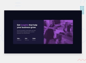
So with this I just used the mobile image and modified it to be able to fit the desktop and the mobile views without a problem, but one thing I did have trouble with was figuring out how you can change the way the text displays- it originally would stretch across the preview container on the desktop view, but then I realized that I can just fix that by changing the width of the text and justify the content. I'm mostly unsure about how to get the highlighted word "insights" in the same way as in the preview. I'm sure it's not a big deal that it's italicized, but I did try to change the <em> tags to <strong> tags in github, and for some reason that didn't really change it at all. I might have to review some of the stuff I've already learned just because I do seem to remember other ways of changing certain words in the text to different colors. But I think my biggest question would be, is it usually a good idea to do what I did for the image, just using the mobile picture for the desktop view and just modifying it with media tags? I know that's worked for some of the projects I've been working on, but I'm working on the newsletter signup right now, and for some reason it doesn't really work when I try to change the dimensions to fit the desktop view- I believe only the width seemed to change, and it did look kind of funky when I did that for the product preview. So anyway, feel free to give me any suggestions and feedback you might have!
Community feedback
- @hitmorecodePosted over 1 year ago
I took a look at what you did and there is too much to fix. I'm going to give you a few tips to put you in the right direction. I'll try and keep it as short as possible. I'm going to start with your html structure
<body>
  <main>
    /* add a div container and inside the div container add two more divs. One is for the left side with the text and the other for the right side with the image */
   /* for the left div use these dimensions width is 570px height is 446px. for the right div width is 540px height 446px*/
  </main>
</body>
To highlight the word insights you could have used a
span.<h1>Get <span>insights</span> that help your business grow.</h1>and use css to style only the span.What I've noticed that you used
position: absolute;on everything, because of this the page is not responsive. Avoid doing this, there are better ways to do this. If you are not familiar with flexbox or css grid, my tip is start learning these two concepts. These are very important for web development and very useful to make pages responsive.I tried to keep this as short as possible se if you can take it from here. If you get stuck and need help let me know.
Marked as helpful1@SolidEnderPosted about 1 year ago@hitmorecode I'll definitely make sure to keep that stuff in mind for next time! The common consensus I seem to be getting is that accessibility and responsiveness are areas that I could really improve on, so I really appreciate your feedback, thank you! And I'll be sure to let you know if I get stuck on anything else, I feel like I'm in pretty good hands when it comes to tips and advice for improvement on here.
0
Please log in to post a comment
Log in with GitHubJoin our Discord community
Join thousands of Frontend Mentor community members taking the challenges, sharing resources, helping each other, and chatting about all things front-end!
Join our Discord
