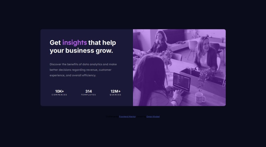


Design comparison

Solution retrospective
Hi Guys 😊 I need some help regarding responsive screens. 📱💻 How can I improve the size of the main container on screens between large and small sizes so that it adapts properly to fit the screen dimensions? 🔧✨
Community feedback
- @DanieleErcoli243Posted about 2 months ago
Hi. I've been reading your CSS, focusing on media queries. I read that you set two media queries for 600 px and 601 px. I've been taught to follow Bootstrap breakpoints (https://getbootstrap.com/docs/5.0/layout/breakpoints/), in order to work on realistic widths for all devices. In order to adapt containers I give a max-width in px and then margin: 0 auto; according to the viewport. Anyway you'd better not work on the main itself, instead create a div and use it as a container inside the main and then create an other div to use as the card. Or at least I've been taught to do so and it works. I hope that this is useful for you. Best wishes.
Marked as helpful1

Please log in to post a comment
Log in with GitHub
Join our Discord community
Join thousands of Frontend Mentor community members taking the challenges, sharing resources, helping each other, and chatting about all things front-end!
Join our Discord