Not Found
Not Found
Not Found
Not Found
Not Found
Not Found
Not Found
Not Found
Not Found
Not Found
Not Found
Not Found
Not Found
Not Found
Not Found
Not Found
Not Found
Not Found
Not Found
Not Found

Submitted

Stats Preview Card

@samsonsham

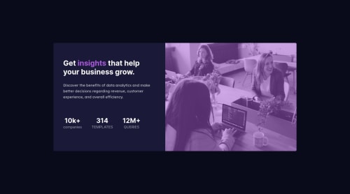
Desktop design screenshot for the Stats preview card component coding challenge

This is a solution for...

  • HTML
  • CSS
1newbie
View challenge

Design comparison


SolutionDesign

Solution retrospective


I got 2 questions in this challenge.

  1. I put a violet colour overlay on top of the image but the colour is way too difference from the design. Style guide has no instruction to that. How could I make the colour as the design does?

  2. I don't know how to determine the media query breakpoint for my responsive design. Style guide said Mobile: 375px, Desktop: 1440px. What does it mean? I try to use (min-width: 1440px) as desktop breakpoint but it doesn't seems to be a correct way to me. Could anybody give me some ideas how to start working with responsive design?

Community feedback

Vanza Setia 27,795

@vanzasetia

Posted

Hello, Samson! 👋

Congratulations on completing this challenge! 🎉 It's great that you have used the landmark elements correctly. Also, it looks good on both mobile portrait and landscape views. Good effort on this challenge! 👍

Regarding your questions,

  • When I was doing this challenge, I used mix-blend-mode to create the purple overlay and it looked darker than the design. But, when I gave feedback to @DarrickFauvel that had done this challenge, he took a look at my solution and gave me a suggestion that I should control the opacity as well. So, because you are using the absolute position method then I would recommend trying to use mix-blend-mode and you could see his solution as your reference if you want.
  • The sizes on the style-guide.md have nothing to do with the media queries. They are telling you that "this is how your website should look like at these screen sizes". As frontend developers, we should keep making your website looks good in between those screen sizes. Also, like @GrzywN has said earlier you could make the layout into two columns until it has enough space.

I would recommend using a ul for the stats and wrapping each stats item with li. By doing that you don't need to wrap each text with p, you can just wrap the text with span because the text is already wrapped by li, which is a meaningful element.

That's it! I hope this information is useful! 😁

Marked as helpful

2

@samsonsham

Posted

@vanzasetia Thank you so much for your supportive words and helpful feedback! I followed your instruction to not only apply mix-blend-mode but also update a bit of opacity but no luck. @DarrickFauvel solution is so nice and I would definitely want to check out what's the trick to do that. I also updated the stat part to use ul li instead. For responsive design, should I well define all resolutions then write the style to different media query respectively, or do the mobile-first and only write the necessary style to a desktop media query?

0
P

@DarrickFauvel

Posted

@vanzasetia Thanks for the mention. 😊

1
Vanza Setia 27,795

@vanzasetia

Posted

@samsonsham No, I would highly recommend using mix-blend-mode and changing the opacity instead of using absolute positioning to create the overlay.

I would recommend writing the styling with the mobile-first approach, which means that write all the styling for the mobile layout first and then uses the min-width media query to style bigger screen sizes. By doing that, you will most likely find yourself writing less code, and also mobile users won't be required to process all of the desktop styles. 😉

1

@samsonsham

Posted

@vanzasetia Thank you so much! I think I could manage to make a very close mix effect finally. And the css is also updated to mobile first approach!

0
Vanza Setia 27,795

@vanzasetia

Posted

@samsonsham Good job with the update! It looks great on my mobile view both landscape and portrait mode! 👏

Keep it up! 👍

0
srglbrkchn 260

@srglbrkchn

Posted

Hey Samson,

I guess the answer to your first question is this:

img { background-color: hsl(277, 64%, 61%); mix-blend-mode: multiply; }

you should set the background color of your image to the color you want to mix with your image, here it was hsl(277, 64%, 61%). And then set mix-blend-mode to multiply. They will get mixed and give you the color you wanted.

About your second question, I do exactly what you did in your code, except I only specify the size of tablet and mobile, since desktop or bigger are the default design so I don't bother with them.

Hope this helps.

Marked as helpful

1

@samsonsham

Posted

@srglbrkchn Thank you for giving a concrete code example! I viewed your source code and like what you do to define tablet and mobile width and would love to try it in my next responsive project.

0
srglbrkchn 260

@srglbrkchn

Posted

@samsonsham My pleasure. Happy it helped.

0

@GrzywN

Posted

Hey, great job on the challenge!

  1. You can try changing overlay to multiply. I think multiply is closer to provided design, but it is still not perfect. As far as I remember I used it in my solution to this challenge, so you can see the screenshot and compare multiply with overlay.
  2. It's kind of weird. Widths in style-guide.md mean widths of the design files provided. For example mobile design has width of 375px. So it depends on you and your project what breakpoint you want to determine. It's the best to just change width and observe when the design should change depending on width.

Have a nice day and happy coding!

Marked as helpful

1

@samsonsham

Posted

@GrzywN Thank you so much for your supporting words! I followed your suggestion to modify my overlay and it is much more closer now! I also try my best to update my media query to make it looks better in any width.

1

@D3press3dd

Posted

Hi Samson let me help you a bit

1.-to get the color like the design you just need to use mix blend mode

2.-you dont need to use a breakpoint like the style guide, they put that as a reference, so the idea is to do it completely responsive where the max screen is 1440 and the min is 375, thats mean that you dont have to worry to do the design for 4k screen or bigger than 1440

1

Vanza Setia 27,795

@vanzasetia

Posted

@D3press3dd It doesn't mean that we don't have to worry about how the site should look on the screen size that is bigger than 1440px. The sizes on the style-guide.md are telling that "this is how your website should look like at these screen sizes". As frontend developers, we should keep making the website looks good on any other screen size.

0

@samsonsham

Posted

@D3press3dd Thanks for your help! Some how I could manage to make my image much similar to the design by mix-blend-mode and have more understanding towards style guide.

0

Please log in to post a comment

Log in with GitHub
Discord logo

Join our Discord community

Join thousands of Frontend Mentor community members taking the challenges, sharing resources, helping each other, and chatting about all things front-end!

Join our Discord