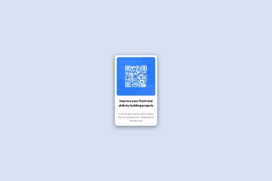
Static page with a QR-Code leading to FrontendMentor.io


Design comparison

Solution retrospective
I'm proud that I completed this and learned a lot. I realize I have a lot to learn.
What challenges did you encounter, and how did you overcome them?Main challenge was not enough knowledge on CSS. I needed to do a lot of online research.
What specific areas of your project would you like help with?Understanding workflow in analyzing the design, translating this in CSS classes and/or elements.
Community feedback
- @MohammedOnGitPosted 7 months ago
Hello clickglue!!!
Your HTML structure is clean and follows basic best practices, but there are a few improvements you can make to enhance both structure and accessibility.
Suggested Improvements: Move the <body> Tag: The <body> tag should directly follow the <head>. Currently, the <header> and <main> tags are placed outside the <body> tag, which breaks the structure of the HTML document.
***Alt Text Enhancement: **** The alt text for the QR code image can be more descriptive. Mention what the QR code does:
<img src="./images/image-qr-code.png" alt="QR code that links to Frontend Mentor website" />***Ensure Semantic HTML: *** The <main> tag is correctly used for the main content. However, since there’s no content in <header> and <footer>, consider removing them unless you plan to add content in those sections later. This simplifies the structure:
***Use of Classes: *** The class names like ff-outfit-700 and ff-outfit-400 could be replaced with more descriptive class names, indicating the purpose of the text instead of the font weight. Example:
<h3 class="headline">Improve your front-end skills by building projects</h3>
<p class="description">
  Scan the QR code to visit Frontend Mentor and take your coding skills to the next level
</p>
Accessibility Improvements:
Wrap the main content inside an <article> for better semantics, as it's a self-contained piece of content:
<main>
  <article>
    <img src="./images/image-qr-code.png" alt="QR code that links to Frontend Mentor website" />
    <h3 class="headline">Improve your front-end skills by building projects</h3>
    <p class="description">
      Scan the QR code to visit Frontend Mentor and take your coding skills to
      the next level.
    </p>
  </article>
</main>
By following these suggestions, your code will become more structured, accessible, and easier to understand both for users and developers. You did great. Keep it up!!!
Marked as helpful1P@clickgluePosted 7 months ago@Aggressive-Mohammed Hi Ibrahim, thank you so much for your very helpful feedback! Great that you spend time and attention to help newbies like me!
0

Please log in to post a comment
Log in with GitHubJoin our Discord community
Join thousands of Frontend Mentor community members taking the challenges, sharing resources, helping each other, and chatting about all things front-end!
Join our Discord