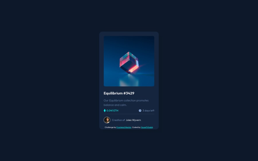
Solution for nft-preview-card-component-main challenge using html/css
Design comparison
Solution retrospective
Had a lot of fun with this project, and I added a simple preview method for the image when It's clicked on. Any feedback regarding any mistake I could have made or just code improvements would be much appreciated thanks :)
Community feedback
- @skyv26Posted over 3 years ago
Hi! Yousef, i noticed some issues.
-
When I clicked on image then cyan overlay not appeared with eye icon properly, you Overlay is behind the image so use zindex with position property in css will solve this issue
-
In some mobile response your image part is going outside the scope (going upwards ) to topside.
I hope you understand
Keep coding
Marked as helpful0@YousefKhalid-iqPosted over 3 years ago@skyv26 Thanks for the feedback, I added a z-index to the image preview that is higher than the z-index for the image itself, and I didn't see what you meant with the 2. point, I tried galaxy fold's dimension and 375px and it looked centered for me.
2@skyv26Posted over 3 years ago@YousefKhalid-iq 😂😂 My friend, I can understand that you completed your work according to requirement. But in web development, every design made by you, never consider what is right or wrong by yourself.
What you have done is come under the bad user experience. I made so many mistakes, I still making mistakes (unintentionally) but I learnt from mistakes and I love learning.
Good Luck 🤞
1 -
Please log in to post a comment
Log in with GitHubJoin our Discord community
Join thousands of Frontend Mentor community members taking the challenges, sharing resources, helping each other, and chatting about all things front-end!
Join our Discord
