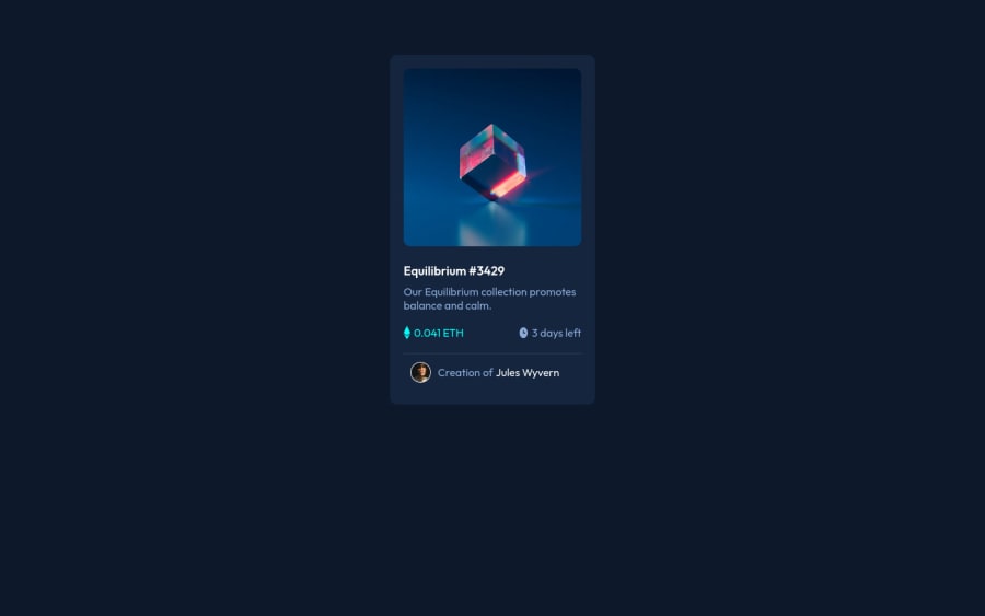
Design comparison
Community feedback
- @ecemgoPosted over 1 year ago
Some recommendations regarding your code that could be of interest to you.
- If you want to center it correctly, you can use flexbox and min-height in the
body:
body { /* height: calc(100vh - 100px); */ /* you'd better use min-height */ min-height: 100vh; display: flex; justify-content: center; align-items: center; }- after using flexbox in the
body, you don't need to usemarginin the.containerin order to center the card:
.container {
    max-width: 300px;    /* max-width makes it responsive  */
    /* margin: 80px auto; */
}
Hope I am helpful. :)
0 - If you want to center it correctly, you can use flexbox and min-height in the
- @0xabdulkhaliqPosted over 1 year ago
Hello there 👋. Congratulations on successfully completing the challenge! 🎉
- I have other recommendations regarding your code that I believe will be of great interest to you.
HTML 🏷️:
- This solution generates accessibility error reports, "All page content should be contained by landmarks" is due to
non-semanticmarkup, which causes lacking of landmark for a webpage
- So fix it by replacing the
<div class="container">element with the semantic element<main>in yourindex.htmlfile to improve accessibility and organization of your page.
- What is meant by landmark ?, They used to define major sections of your page instead of relying on generic elements like
<div>or<span>. They are use to provide a more precise detail of the structure of our webpage to the browser or screen readers
- For example:
- The
<main>element should include all content directly related to the page's main idea, so there should only be one per page - The
<footer>typically contains information about the author of the section, copyright data or links to related documents.
- The
HEADINGS ⚠️:
- This solution has also generated accessibility error report due to lack of level-one heading
<h1>
- Every site must want at least one
h1element identifying and describing the main content of the page.
- An
h1heading provides an important navigation point for users of assistive technologies, allowing them to easily find the main content of the page.
- So we want to add a level-one heading to improve accessibility by reading aloud the heading by screen readers, you can achieve this by adding a
sr-onlyclass to hide it from visual users (it will be useful for visually impaired users)
CSS 🎨:
- Looks like the component has not been centered correctly. So let me explain, How you can easily center the component without using
marginorpadding.
- We don't need to use
marginandpaddingto center the component both horizontally & vertically. Because usingmarginorpaddingwill not dynamical centers our component at all states, Just add the following style rule
body { display: grid; place-items: center; min-height: 100vh }- Now remove these styles, after removing you can able to see the changes
.container {
   margin: 80px auto;
}
- Now your component has been properly centered
.
I hope you find this helpful 😄 Above all, the solution you submitted is great !
Happy coding!
0 - @HassiaiPosted over 1 year ago
Replace <div class="container"> with the main tag and <p class="title"> with <h1> to fix the accessibility issues. click here for more on web-accessibility and semantic html
Every html must have <h1> to make it accessible. Always begin the heading of the html with <h1> tag wrap the sub-heading of <h1> in <h2> tag, wrap the sub-heading of <h2> in <h3> this continues until <h6>, never skip a level of a heading.
There is no need to give the body a height value
To center .container on the page using flexbox or grid instead of margin,
- USING FLEXBOX: add min-height:100vh; display: flex; align-items: center: justify-content: center; to the body
body{ min-height: 100vh; display: flex; align-items: center; justify-content: center; }- USING GRID: Add min-height:100vh; display: grid place-items: center to the body
body{
min-height: 100vh;
display: grid;
place-items: center;
}
Use relative units like rem or em as unit for the padding, margin, width values and preferably rem for the font-size values, instead of using px which is an absolute unit. For more on CSS units Click here
For a responsive content replace the width in .container with
max-width.Hope am helpful.
Well done for completing this challenge. HAPPY CODING
0
Please log in to post a comment
Log in with GitHubJoin our Discord community
Join thousands of Frontend Mentor community members taking the challenges, sharing resources, helping each other, and chatting about all things front-end!
Join our Discord
