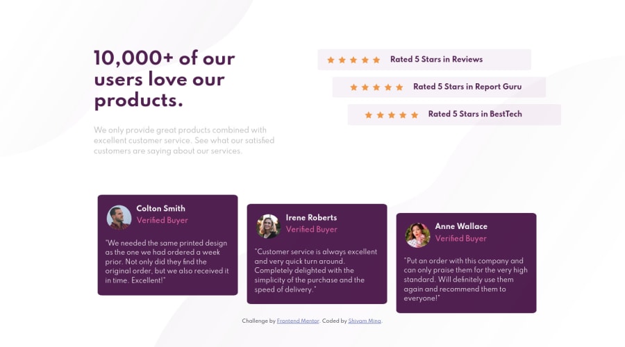
Design comparison
Solution retrospective
I m beginner , my output seems right but my code seems little bit less readable. I will try writing better code in upcoming challenges. if u saw my work , any comments are welcomed
Community feedback
- @infiniteowl05Posted almost 4 years ago
Hi @shivam-mina 👋
Nice work on this challenge. Its quite responsive as well.
A few suggestions:
- bg-pattern-bottom is not positioned at the bottom in Mobile. You could define images as background-image and position them using background-position as follows: body{ background-image: url(images/bg-pattern-bottom-mobile.svg),url(images/bg-pattern-top-mobile.svg); background-repeat: no-repeat,no-repeat; background-position: right bottom, left top; }
- Include more Media queries for different viewport size, as ratings section is not much responsive with width 1000px to 1400px.
- Testimonial section has spacing and image size issue. This can be handled with media queries as stated above.
CSS Flexbox and CSS GRid would be a good add-on.
Happy Coding 😊.
2 - @JesusAtao96Posted almost 4 years ago1
- @ApplePieGiraffePosted almost 4 years ago
Hello there, SHIVAM MINA! 👋
I just wanted to say, congratulations on completing your first Frontend Mentor challenge! 🎉 Good work on this one! 👍
I just suggest taking a look at your solution report and trying to clear up some of the errors there. For example, it's better to use forward slashes rather than backslashes when specifying file paths in your code, and it's recommended to only put spans inside of spans (not divs inside of spans, since divs are block-level elements). 😉
Keep coding (and happy coding, too)! 😁
0
Please log in to post a comment
Log in with GitHubJoin our Discord community
Join thousands of Frontend Mentor community members taking the challenges, sharing resources, helping each other, and chatting about all things front-end!
Join our Discord
