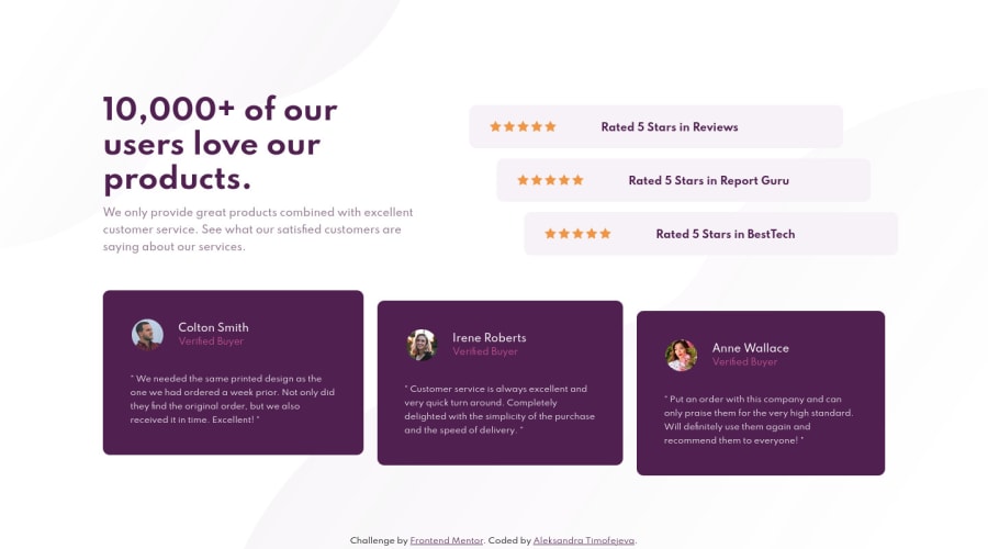
Design comparison
SolutionDesign
Community feedback
- @Robert-RynardPosted almost 3 years ago
Looks great! The top part of your site seems to be getting cut off right after the 900px media query that you might want to take a look at. Nice job!
Marked as helpful0 - @PhoenixDev22Posted almost 3 years ago
Great work Robert Rynard ! I have noticed few things i hope they might help:
For this
<p class="title">10,000+ of our users love our products.</p>is better to use <h1>.Try to use more semantic tags as
<figure> <figcaption> ..0
Please log in to post a comment
Log in with GitHubJoin our Discord community
Join thousands of Frontend Mentor community members taking the challenges, sharing resources, helping each other, and chatting about all things front-end!
Join our Discord
