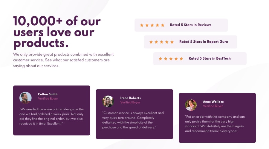
Design comparison
Solution retrospective
I think I did it right :) I did two break points: 375px and 1440px (previously I did one more in the middle).
However, I think I did something wrong with the background. Could someone check it out? :)
Thanks and hugs! :)
Community feedback
- @vanzasetiaPosted about 3 years ago
👋Hi Gutka! First, I can't find the CSS file on your GitHub repo 😅. I also had see the source code, but I couldn't open the CSS file.
I have some feedback on this solution:
- Heading order is important. You need to use
h2first, before you can useh3. - Rated 5 Stars... should not be a heading. Heading tags is used for titling section. If you think that is an important information, I recommend to use
strongtag. - The
altvalue should not be hyphenated. It should be human readable and informative. - The star icons are decorative images. Remember, for any decorative images, you should leave the
alt=""and addaria-hidden="trueorrole="presentation". Or you can just usebackground-imageas Tediko said. - If you're going to use
background-image, there's a gotcha. You need to change thewidthvalue on theicon-star.svgfile to create a space. I recommend to increase it to22(based on Tediko Solution) to create a space on the right side of the icon, since you can't usemarginorpaddingon background. - The
feedback__nameshould not be a heading too. - For the
altvalue for the photo, I recommend to just fill it with their name.alt="Colton Smith".
That's it! Hopefully this is helpful!
Marked as helpful2@karbowskamPosted about 3 years ago@vanzasetia thank you very much for your detailed advices. It will help me in my further learning. I love writing code in SCSS format so there is no CSS file in my repo 🙈
0@vanzasetiaPosted about 3 years ago@karbowskam I also really ❤️ Sass with SCSS syntax, but usually the Sass files will get compile into CSS file. So how it can be possible without any CSS? Even though your HTML linking to
css/style.csswhich is doesn't exist on your repo 😅.0 - Heading order is important. You need to use
- @tedikoPosted about 3 years ago
Hello, Gutka! 👋
Congrats on finishing another challenge! 🎉 Your solution looks good. Here's my few tips:
- Less breakpoints doesn't necessary means better. Now, your solution isn't fully responsible. It does look good on mobile and on larger desktops but everything inbetween does look like mobile and it isn't good. Here is my old solution to this challenge just to illustrate you how it can behave across screen sizes.
- You repeat your HTML code with star images which is unnecessary. Find the way to use only one star image. You can do it easily by using
background-repeatapproach in your css. To do this you'll have to create emptydivand remove allimg's.
Good luck with that, have fun coding! 💪
Marked as helpful2@karbowskamPosted about 3 years ago@tediko thank you very much for your helpful feedback. Your tips are valuable to me 🙂
0
Please log in to post a comment
Log in with GitHubJoin our Discord community
Join thousands of Frontend Mentor community members taking the challenges, sharing resources, helping each other, and chatting about all things front-end!
Join our Discord
