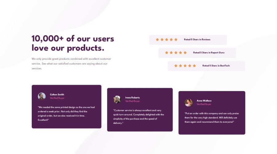
Design comparison
Solution retrospective
I’m particularly proud of how I successfully implemented a responsive design that adapts seamlessly to both desktop and mobile devices. The layout adjustments, including the staggered positioning of reviews, add a visually engaging touch to the design.
Next time, I would explore accessibility improvements, like adding ARIA roles and testing the project with screen readers to ensure a more inclusive user experience.
What challenges did you encounter, and how did you overcome them?Adjusting the background images for the desktop version was tricky since the provided design files required precise alignment.
Solution: I used media queries and experimented with background-size and background-position properties until the images matched the design specifications.
What specific areas of your project would you like help with?Performance optimization: Suggestions on reducing potential rendering or loading issues (e.g., optimizing CSS for faster load times) would be valuable for refining the project further.
Community feedback
Please log in to post a comment
Log in with GitHubJoin our Discord community
Join thousands of Frontend Mentor community members taking the challenges, sharing resources, helping each other, and chatting about all things front-end!
Join our Discord
