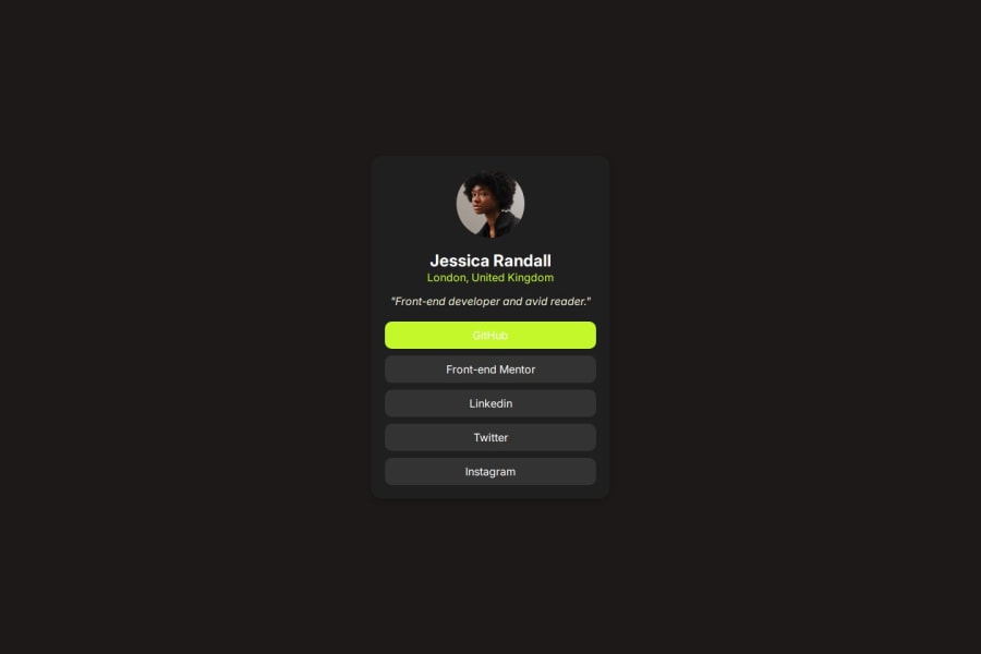
Design comparison
SolutionDesign
Solution retrospective
What are you most proud of, and what would you do differently next time?
- I have implemented a HTML,CSS project after long time
- I have regained some basics of HTML,CSS
- I forgot some tags
Community feedback
- @CrtykwodPosted 3 months ago
Hello!! I'm not an expert, but I hope I can help you fix some errors:
Firstly, the button should only turn green when the mouse hovers over it
HTML:
- You need to include an
alt=""in the<img>. This is fundamental for accessibility. - Instead of using
<div>s, you should use semantic tags like<main>,<section>,<header>...
CSS:
- Use
<link>in<head>instead of@importto get the font, this will give a slight performance boost. - Do not use
height: 100vhon the body, prefermin-height: 100vh. It will sound like "Use height of at least 100vh", which ensures more compatibility. - It seems that you chose to use your own colors and spacing measurements, think that this challenge is a job that you will do for a company. If they provide specific colors and spacing, you should use them.
That's what I noticed, I hope it helps in some way! <3
0 - You need to include an
Please log in to post a comment
Log in with GitHubJoin our Discord community
Join thousands of Frontend Mentor community members taking the challenges, sharing resources, helping each other, and chatting about all things front-end!
Join our Discord
