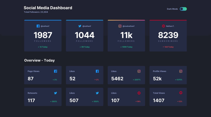
Social Media Dashboard with theme Switcher Using HTML, CSS, jQuery.
Design comparison
Community feedback
- @grace-snowPosted about 4 years ago
Another accessibility point actually - you need a label on your checkbox that says it is for dark mode. The easiest way to do that with your markup is probably to add an id to tour dark mode paragraph and use the aria-labelled by attribute on the input to associate them.
Well done for using a checkbox for your toggle, that's a really nice way to do it.
0 - @grace-snowPosted about 4 years ago
After a quick glance, it looks really really nice. Only issue I see straight away is your html structure isn't flowing right in the code. It's really important you only use headings where necessary and that heading tags go in a logical order.
A god way to check this is to turn your page styles off completely - check what the document looks like. Is it obvious what content belongs to what section? Another way is to use a screen reader.
If you want to change text size or styles, that's easy to do. When building it's no harder to use the correct heading tags, but that small act makes a huge difference to assistive technology users (like me)
Design looks really nice on mobile though, so we'll done there
0
Please log in to post a comment
Log in with GitHubJoin our Discord community
Join thousands of Frontend Mentor community members taking the challenges, sharing resources, helping each other, and chatting about all things front-end!
Join our Discord
