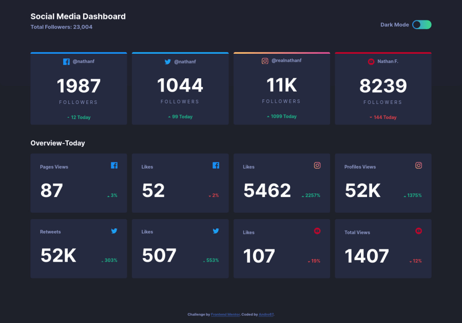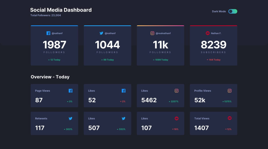
Design comparison
Solution retrospective
Hello! Any feedback is welcome ! ;)
Community feedback
- @ApplePieGiraffePosted over 4 years ago
Hey, Andro87! 👋
Nice to see complete yet another challenge! You've done a good job on this one! 👍
Your solution looks good, responds very nicely, and the light/dark themes work well! 👏
I only suggest,
- Adding a
max-widthto the main container or wrapper so that the content of the page doesn't look too stretched on extra-large screens. - Like NDOY3M4N mentioned, adding a hover state to the cards would be a nice touch and complete the challenge!
Keep coding (and happy coding, too)! 😁
0@Andro87Posted over 4 years agoHi @ApplePieGiraffe! Thanks for the suggestions. I add the hover state now!! ;)
0 - Adding a
- @NDOY3M4NPosted over 4 years ago
Hi @Andro87, nice reproduction of the design. Maybe you can try adding the hover effect on the cards to complete the challenge.
0
Please log in to post a comment
Log in with GitHubJoin our Discord community
Join thousands of Frontend Mentor community members taking the challenges, sharing resources, helping each other, and chatting about all things front-end!
Join our Discord
