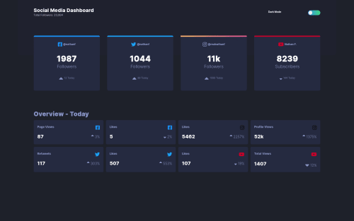
Social media dashboard with theme switch using html css and Js
Design comparison
Solution retrospective
Hi! check out my work. All feedback and corrections are highly welcome!
Community feedback
- @emestabilloPosted about 4 years ago
Hey Faruq, congrats on completing this challenge! Here are a few thoughts:
-
For UX, I think it'd be better to target
.toggle-box
for your JS instead of.button
. The user will normally just click on the slider if they want to switch between light and dark modes, not follow the button where it moved. -
The instagram card is missing its border-radius. I would use a pseudo-element like
::before
to achieve this instead ofborder
, which does not take border-radius -
The instagram icons are not displaying their gradients
-
.sm-footer
and figures under.count
could use color adjustments to stay stay close to the design
Hope this helps!
0@PhrukeyPosted about 4 years agoHi Emmilie, thank you so much for the feedback. I hope you can see them (and you like them). Thanks again.
1@emestabilloPosted about 4 years ago@Phrukey Looks much better! I forgot to mention that the html is lacking its
h1
tag, instead of starting withh2
which messes with accessibility. Resolving the issues on the report and looking into the use ofsections
would also take the project into the next level. Thanks for taking my suggestions! Well done!0 -
Please log in to post a comment
Log in with GitHubJoin our Discord community
Join thousands of Frontend Mentor community members taking the challenges, sharing resources, helping each other, and chatting about all things front-end!
Join our Discord