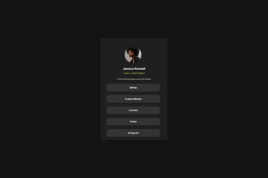


Design comparison

Community feedback
- @skyv26Posted 2 months ago
Hi @THEDUNSINAJAYI 👋,
I’ve reviewed your HTML and CSS code, and here are some suggestions to enhance the structure, readability, and responsiveness:
1. HTML Structure:
-
Heading Tag Hierarchy: Currently, you are using
<h4>and<h6>, but the correct hierarchy should be followed for better accessibility and SEO. I recommend using<h3>for the name and<h5>for the location to keep a proper heading structure. -
Social Media Links: For better semantics and accessibility, it's better to wrap your social media links in a list using
<ul>and<li>tags. This will improve the overall structure and make it easier to maintain.Example:
<ul class="social-links">
    <li><a class="social-link" href="#">GitHub</a></li>
    <li><a class="social-link" href="#">Frontend Mentor</a></li>
    <li><a class="social-link" href="#">LinkedIn</a></li>
    <li><a class="social-link" href="#">Twitter</a></li>
    <li><a class="social-link" href="#">Instagram</a></li>
</ul>
2. CSS Suggestions:
-
Avoid Fixed Height: In your CSS, you’ve used a fixed height for
.beans. It’s better to avoid fixed heights and allow the inner content to determine the height of the container. This will make the layout more flexible and responsive. -
DRY Principle: The styles for your anchor tags (
.github,.front,.link, etc.) are very similar. To follow the DRY (Don’t Repeat Yourself) principle, you can combine common styles into a reusable class. This will make your code cleaner and easier to maintain.Example:
.social-link {
    text-decoration: none;
    text-align: center;
    background-color: hsl(0, 0%, 20%);
    padding: 13px 100px;
    border: 0;
    border-radius: 12px;
    color: white;
    font-family: "Inter", serif;
    font-weight: 700;
    font-size: 12px;
    align-items: center;
    justify-content: center;
    display: flex;
    white-space: nowrap;
    width: 80%;
}

.social-link:hover {
    color: black;
    background-color: hsl(75, 94%, 57%);
}
Now, instead of repeating the same styles for each anchor tag class, just use
.social-linkfor all the social media links. -
Responsiveness: It seems that the fixed height could impact the responsiveness of the page on smaller screens. Let the content decide the height, and avoid rigid dimensions to ensure the design adjusts well on various screen sizes. Your use of media queries is great! Keep up the good work there.
3. General Recommendations:
- Modular CSS: You may want to adopt a modular approach for your CSS. Group similar styles together and avoid unnecessary repetition. This will help you maintain and scale your project more effectively.
- Learning CSS Properties: To avoid "hit and trial," I encourage you to dive deeper into understanding CSS properties. Experiment with flexbox, grid, and other layout techniques to create more robust and flexible designs. 💡
Final Thoughts:
By following these suggestions, your code will become more structured, accessible, and responsive. The use of correct heading hierarchy and semantic tags will enhance your SEO and make your site easier to navigate for all users. 🎯
0 -

Please log in to post a comment
Log in with GitHub
Join our Discord community
Join thousands of Frontend Mentor community members taking the challenges, sharing resources, helping each other, and chatting about all things front-end!
Join our Discord