Design comparison
Solution retrospective
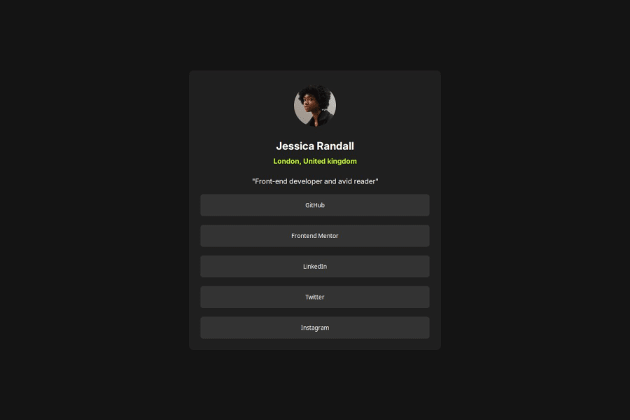
I think i did well, thinking the width might be too much tho
What challenges did you encounter, and how did you overcome them?Nothing much, really, getting the hang of it
What specific areas of your project would you like help with?Anything the community feels needs to be corrected
Community feedback
- @0pazizPosted 2 months ago
hey, nice job but one thing i have noticed its that you have assign the width with invalid value (width: 60vh;) the vh unit is based on the height of the viewport, so it controls vertical dimensions. If you meant to set the width relative to height for a specific effect, you might need to use CSS grid, flexbox, or aspect-ratio to maintain proportions.
have a nice day.
Marked as helpful0 - P@jayco01Posted 2 months ago
Hey Samuel! Great job on your solution! I like how you used :root for color variables. It's a nice way to keep things organized. I've never seen that before, might have to give it a try next time.
A couple of suggestions:
-
Try using CSS classes instead of styling generic elements (h1, p, button) to make your HTML cleaner and more reusable.
-
The buttons are a bit too wide; adjusting the width or adding max-width might make them look better.
-
Since these are social media links, using <a> tags instead of <button> would be more semantic and functional.
Overall, solid work! Keep it up!
Marked as helpful0 -
- P@toshirokubotaPosted 2 months ago
Hi, your solution looks very good. One comment I can add is that you do not have :focus on button elements. I would add the pseudo class with button:hover. This way, the user can get a feedback from tab based selection of buttons.
Happy coding!
Marked as helpful0
Please log in to post a comment
Log in with GitHubJoin our Discord community
Join thousands of Frontend Mentor community members taking the challenges, sharing resources, helping each other, and chatting about all things front-end!
Join our Discord
