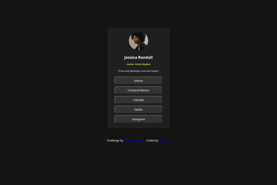
Design comparison
Solution retrospective
What fills me with pride in this new task is that my understanding has improved compared to the previous one. My grasp of HTML structure has strengthened and my CSS is becoming clearer and clearer.
What challenges did you encounter, and how did you overcome them?For this challenge, I had no difficult task.
What specific areas of your project would you like help with?I think I need help and documentation to better understand padding in all its aspects.
Community feedback
- @grace-snowPosted 7 months ago
I'll add to the above that you need to remove all the extra unnecessary divs in this. It really is just one card with an image, heading, two paragraphs and a list of links (anchors). There is no need for divs inside the card.
Also the component must not have an explicit height or width. It doesn't need a height at all — it's the browsers job to decide what height is needed based on the content inside the card. It can have width 100% if you like but should definitely have a max width in rem.
None of the links should have widths and heights either. Again it can have width 100% if you like but the height comes naturally from the content and the padding in the links.
Oh and definitely don't change widths on hover! That is terrible for performance and user experience.
Once you've done this and applied the feedback above you can remove the media query.
Marked as helpful0 - P@StroudyPosted 7 months ago
Awesome job tackling this challenge! You’re doing amazing, and I wanted to share a couple of suggestions that might help refine your approach…
-
Using a
<main>tag inside the<body>of your HTML is a best practice because it clearly identifies the main content of your page. This helps with accessibility and improves how search engines understand your content. -
Your heading elements
<h1><h3>, Heading elements should be in sequentially-descending order (e.g.,<h1>,<h2>,<h3>) to create a clear content structure, improving accessibility and SEO. Skipping levels or using them out of order can confuse screen readers, affect search engine rankings, and make your content harder to understand. -
I would put these into a
<ul> <li>, and the text should be wrapped with a<a>so it is accessible with a keyboard using the tab key, Using an<a>tag for navigation is semantically correct, improves accessibility for screen readers, and ensures consistent behavior across browsers, unlike a<button>or a<div>not intended for links.
<div class="links_buttons"> <div class="button"> <button>GitHub</button> </div> <div class="button"> <button>Frontend Mentor</button> </div> <div class="button"> <button>LinkedIn</button> </div> <div class="button"> <button>Twitter</button> </div> <div class="button"> <button> Instagram</button> </div> </div>-
Using
font-display: swapin your@font-facerule improves performance by showing fallback text until the custom font loads, preventing a blank screen (flash of invisible text). The downside is a brief flash when the font switches, but it’s usually better than waiting for text to appear. -
Using a full modern CSS reset is beneficial because it removes default browser styling, creating a consistent starting point for your design across all browsers. It helps avoid unexpected layout issues and makes your styles more predictable, ensuring a uniform appearance on different devices and platforms, check out this site for a Full modern reset
-
Developers should avoid using pixels (
px) because they are a fixed size and don't scale well on different devices. Instead, useremorem, which are relative units that adjust based on user settings, making your design more flexible, responsive, and accessible. For more information check out this, Why font-size must NEVER be in pixels or this video by Kevin Powell CSS em and rem explained.- Another great resource for px to rem converter.
You’re doing fantastic! I hope these tips help you as you continue your coding journey. Stay curious and keep experimenting—every challenge is an opportunity to learn. Have fun, and keep coding with confidence! 🌟
Marked as helpful0 -
Please log in to post a comment
Log in with GitHubJoin our Discord community
Join thousands of Frontend Mentor community members taking the challenges, sharing resources, helping each other, and chatting about all things front-end!
Join our Discord
