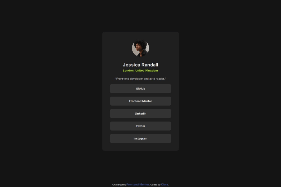
Design comparison
Solution retrospective
It is only my third project ever, I can see how much I've learned about every single step of the project, from planning to deploy and using git.
What challenges did you encounter, and how did you overcome them?I wanted to improve the mobile version. To prevent the page scrolling underneath the UI I've used svh units(small viewport height) for the first time and it worked. I found this tip on the Webflow youtube channel.
What specific areas of your project would you like help with?I would to improve the media queries breakpoints. What I normally do is to set the breakpoint based on what I think looks better when I resize the page with the Devtool. I'd like to know if there is a better way of doing this, any reference guide or something like it?
Community feedback
- @Sarah-MousaPosted 5 months ago
It amazing , I think mine needs some height, but yours is perfect mashallah.
0
Please log in to post a comment
Log in with GitHubJoin our Discord community
Join thousands of Frontend Mentor community members taking the challenges, sharing resources, helping each other, and chatting about all things front-end!
Join our Discord
