Not Found
Not Found
Not Found
Not Found
Not Found
Not Found
Not Found
Not Found
Not Found
Not Found
Not Found
Not Found
Not Found
Not Found
Not Found
Not Found
Not Found
Not Found
Not Found
Not Found

Submitted

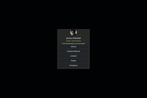
Social Links Profile Responsive Page

sour413 30

@sour413

Desktop design screenshot for the Social links profile coding challenge

This is a solution for...

  • HTML
  • CSS
1newbie
View challenge

Design comparison


SolutionDesign

Solution retrospective


What are you most proud of, and what would you do differently next time?

I am proud of that I improved in making responsive pages using bootstrap framework, The different things i could do is create more responsive pages like these and implement javascript and more media query techniques.

What challenges did you encounter, and how did you overcome them?

The Only challenges I faced is alignment challenges using flex, I overcame with the help of w3c schools and help from one of the members from Frontend mentorship from my previous projects.

What specific areas of your project would you like help with?

I would like help in Web-page responsiveness, that's it, I would like to build pages for mobile, tablets and PC, I would like help for building more responsive web pages.

Community feedback

MikDra1 5,990

@MikDra1

Posted

If you want to make your card responsive with ease you can use this technique:

.card {
width: 90%;
max-width: 37.5rem;
}

On the smaller screens card will be 90% of the parent (here body), but as soon as the card will be 37.5rem (600px) it will lock with this size.

Also to put the card in the center I advise you to use this code snippet:

.container {
display: grid;
place-items: center;
}

Hope you found this comment helpful 💗💗💗

Good job and keep going 😁😊😉

0
P
Steven Stroud 4,080

@Stroudy

Posted

Amazing job with this! You’re making fantastic progress. Here are some small tweaks that might take your solution to the next level…

  • Avoid using the role attribute when native HTML tags (e.g., <main>, <body>) already provide meaning, as this is redundant and unnecessary for proper accessibility.

  • Using !important is not recommended because it overrides all other styles, making debugging and maintenance difficult, causing conflicts, reducing flexibility, and limiting the ability to create scalable, modular CSS.

  • Having a clear and descriptive alt text for images is important because it helps people who use screen readers understand the content, making your site more accessible. It also improves SEO, as search engines use alt text to understand the image's context, helping your site rank better, Check this out Write helpful Alt Text to describe images,

<img alt="..." role="image">
  • I would put these into a <ul> <li>, and the text should be wrapped with a <a> so it is accessible with a keyboard using the tab key, Using an <a> tag for navigation is semantically correct, improves accessibility for screen readers, and ensures consistent behavior across browsers, unlike a <button> or a <div> not intended for links.
<div class="d-grid gap-2">
   <button type="button" class="btn btn-dark" type="button">Github</button>
   <button type="button" class="btn btn-dark" type="button">Frontend Mentor</button>
   <button type="button" class="btn btn-dark" type="button">Linkedin</button>
   <button type="button" class="btn btn-dark" type="button">Twitter</button>
   <button type="button" class="btn btn-dark" type="button">Instagram</button>
</div>
  • Using a <main> tag inside the <body> of your HTML is a best practice because it clearly identifies the main content of your page. This helps with accessibility and improves how search engines understand your content.

  • Using a full modern CSS reset is beneficial because it removes default browser styling, creating a consistent starting point for your design across all browsers. It helps avoid unexpected layout issues and makes your styles more predictable, ensuring a uniform appearance on different devices and platforms, check out this site for a Full modern reset

You’re doing fantastic! I hope these tips help you as you continue your coding journey. Stay curious and keep experimenting—every challenge is an opportunity to learn. Have fun, and keep coding with confidence! 🌟

0
Fachrezi 140

@Fbeye04

Posted

hey bro, good job on your project this time but I want to give you some feedback that you might be able to implement to make your project better.

  • try wrapping the name and description using hgroup tag then you can change the paragraph tag to h1 tag for the name.
  • instead of using buttons, it would be better if you use list and ul tags it will be more relevant and easier in styling
  • learn and use root css so that your page is clean from the browser's default style so that it is more free for you to modify the display. In addition, apply css custom properties so that you can apply as provided from the style guide file.
  • instead of 80vh I recommend that the body use 100vh so that the display is right in the center of the page
  • you don't have to declare important on all styles because if you place the style where it should be then the style will be applied without any interference.
  • for margin, padding and width try to define using numbers like 1rem or 1em and reduce the use of auto.
  • try to learn breakpoints on bootstrap it will help you create responsive displays for various types of screens Those are the suggestions that I can give so that the appearance of your project is better, there are many things that must be improved but consistency and commitment are also required so that your skills continue to grow. Good job bro!
0
hominhk3 40

@hominhk3

Posted

good

0

Please log in to post a comment

Log in with GitHub
Discord logo

Join our Discord community

Join thousands of Frontend Mentor community members taking the challenges, sharing resources, helping each other, and chatting about all things front-end!

Join our Discord