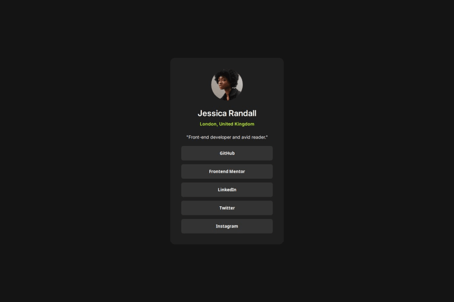


Design comparison
SolutionDesign

Solution retrospective
What are you most proud of, and what would you do differently next time?
I am proud of the overall accuracy as i think it looks almost identical to the reference. I also implemented some of the suggestions given on my last project.
Please log in to post a comment
Log in with GitHubCommunity feedback
- P@MikDra1
For a quick and easy way to make your card responsive, use the following CSS:
.card {
  width: 90%;
  max-width: 37.5rem;
}
On smaller screens, the card will occupy 90% of its parent container, and once it reaches 37.5rem (600px), it will maintain that width.
To center the card, try this:
.container {
  display: grid;
  place-items: center;
}
Hope this helps! 💗💗💗
Keep up the great work! 😁😊😉
- @devsiders
I really liked the design.


Join our Discord community
Join thousands of Frontend Mentor community members taking the challenges, sharing resources, helping each other, and chatting about all things front-end!
Join our Discord