Design comparison
SolutionDesign
Community feedback
- P@juliengDevPosted 10 months ago
Hey @Esmee29, it's me again! :) Great job overall! I noticed a few areas for improvement:
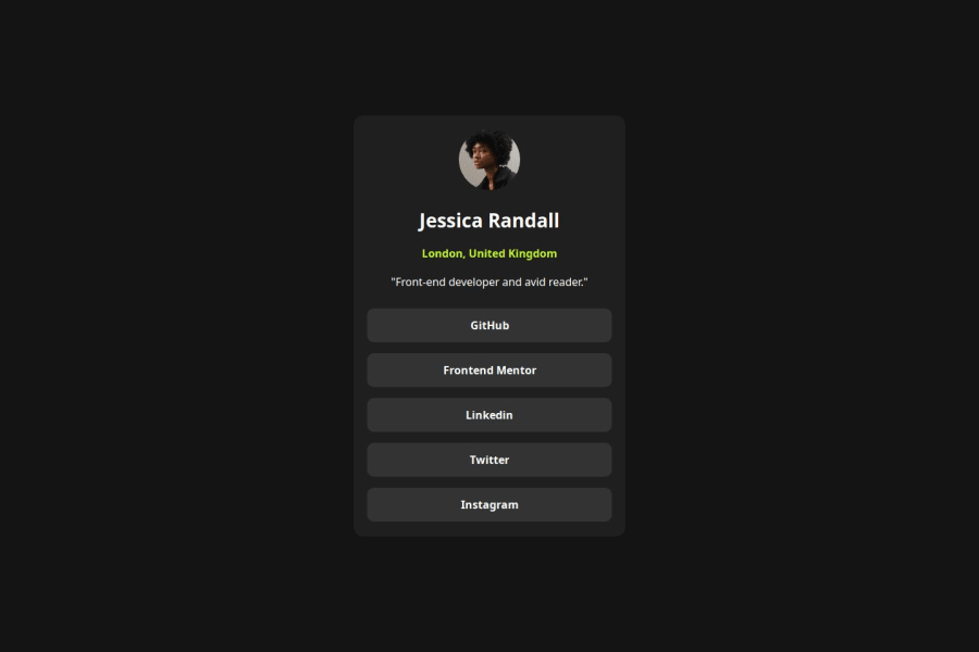
The padding inside the content box could be adjusted. Your links appear slightly wider compared to the desktop design in the Figma file.
That said, I've observed that there are often small differences between the design and the final result, so it's not a major issue. Keep up the good work, mate! <3 C
Marked as helpful0
Please log in to post a comment
Log in with GitHubJoin our Discord community
Join thousands of Frontend Mentor community members taking the challenges, sharing resources, helping each other, and chatting about all things front-end!
Join our Discord
