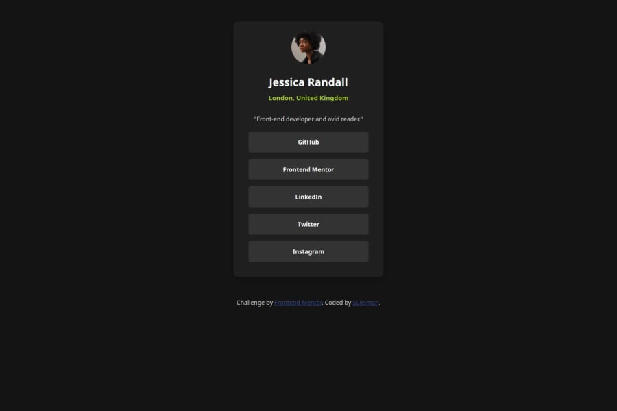
Design comparison
Solution retrospective
design to code
What challenges did you encounter, and how did you overcome them?to understand readme-temp;ate.md
What specific areas of your project would you like help with?#flexbox
Community feedback
- P@Kiara523Posted 5 months ago
Hello, overall the project looks good, although there is always room for improvement.
I can only see one of the three layout, I believe there was a different layout for mobile, desktop and laptop, try using relative units (rem, em, %) and media queries can help you make the page more responsive.
Setting a width and a height (.card) to something can compromise the responsiveness of the page, if you can try to go for min-width/min-height or max-width/max-height instead.
I believe that using a display: flex for the body it would have made it easer to center the card and also to align the items within. Make sure that the flexbox has enough room to move if you want to center something. You can have a flexbox inside another flexbox and so on..
For CSS there are very good resources out there, here are some that I use: w3schools webpage, MDN Mozilla developers webpage, Kevin Powell has a you tube channel with plenty of CSS explanation.
The readme-template is a guide on how to fill it up, you have to modify the generic text with your own info, for example replacing the live URL link etc. If you use VSCode when you open the readme file at top right corner there is a button that looks like a book with a magnifier, press it to see the preview of the file, it might be helpful.
I hope that my feedback was useful... let's keep up the good work! 👍
0
Please log in to post a comment
Log in with GitHubJoin our Discord community
Join thousands of Frontend Mentor community members taking the challenges, sharing resources, helping each other, and chatting about all things front-end!
Join our Discord
