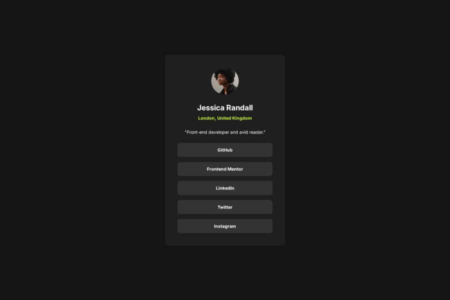
Design comparison
Solution retrospective
I learned about responsive design and how to transition differently for ease in and ease out
Community feedback
- P@clickgluePosted 6 months ago
Wauw this is beautiful! The ease in and out are great, very elegant. I was just wandering: you use px as dimension, I understood from another review that we should try to use rem instead: is that correct? I don't know, I don't have much experience.
0P@shakthivel-rnPosted 6 months ago@clickglue Hi, thanks a lot for the review. I am not sure about the rems, I followed the dimensions specified in the figma design. Maybe using rems is a best practice that we should follow!
0
Please log in to post a comment
Log in with GitHubJoin our Discord community
Join thousands of Frontend Mentor community members taking the challenges, sharing resources, helping each other, and chatting about all things front-end!
Join our Discord
