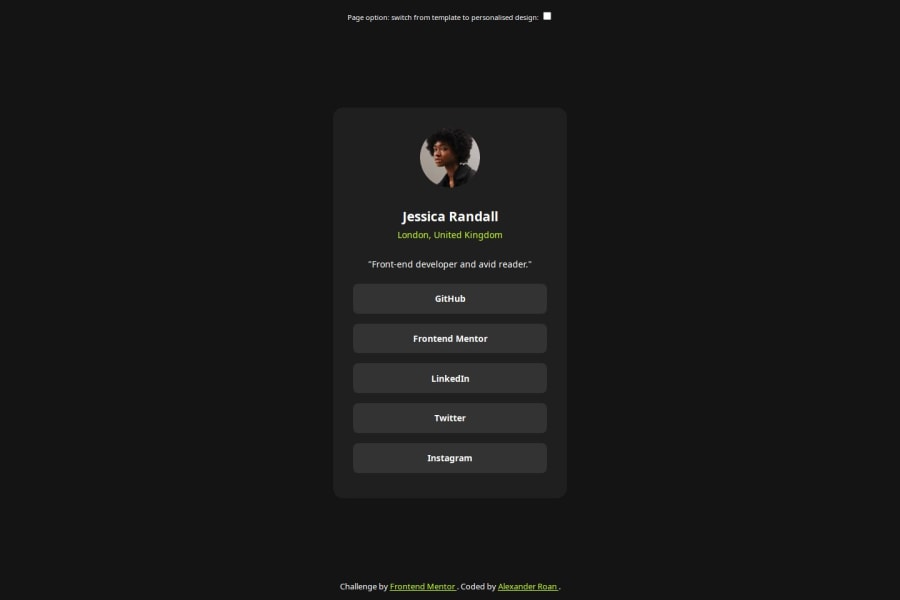
Social links - CSS and JS to switch betwen template & personal styles


Design comparison

Solution retrospective
I decided to try and go a bit further than the template and add a second verison with colour and content adjustments. I used JavaScript to do this. I found this experience useful as I learnt a little bit about inheritence and precedence when trying to switch styles between CSS items with id selectors using classes. I also hadn't realised getElementByClassName returned a live collection vs. documentQuerySelectorAll returning a static nodelist.
What challenges did you encounter, and how did you overcome them?Just getting used to precedence.
Was initially a bit unsure on whether to use alternate classes in CSS for styling changes or whether to hard code the alternate styles values in JavaScript. I decided on the former approach as I think it's easier to manage future style adjustments if all style factors are in CSS. I think the content changes have to be hardcoded into JavaScript, at least without having a database?
What specific areas of your project would you like help with?Wondering if my JavaScript approach is relatively efficient or if there are better ways to do this?
Community feedback
- @TedJenklerPosted 7 months ago
Hi @dearestalexander,
Nice project! I love how you’ve added your own touch—always fun to see creative ideas come to life. I’m heading to Bangkok next month myself, so can’t wait for some vacation time!
Great job on the detailed README. It’s often overlooked but so useful for future reference. A small suggestion: organize images in an assets folder to tidy up your GitHub structure.
You’ve received lots of feedback already, so I’ll sum it up with the most important ones to help take your projects to the next level:
1.Centering: "Use flex properties and min-height: 100svh to center your component." Avoid fixed width; use max-width in rem.
2.Naming conventions: Try BEM for more scalable CSS.
3.ID selectors: "Stick with class="" for styling, as #ID is best for JavaScript."
4.Responsive design: "Use max-width: 100% for responsiveness over width: 100%."
5.Font-size: "Avoid px; use rem or em for responsive typography."
(Not ordered by importance just for readability)
Keep up the great work!
Best, Teodor
(@Stroudy and @grace-snow gave really good feedback. Try making a list, cross it off as you go, and you’ll implement all the tips in no time.
@Coder-Sadik’s feedback is good, but in this project, I’d say once you purge unnecessary divs and add semantic elements, there’s no real need for ARIA labels (Made that mistake myself before.
Thanks again for catching that “lacking” learned alot by that mistake, @geomydas!).
Marked as helpful1P@dearestalexanderPosted 7 months agoHi @TedJenkler
Thanks for the feedback. Yes - I was delighted to see all the detailed feedback from Grace, Steven and now you.
I keep quite detailed notes from my learning on HTML / CSS and javascript that I keep in markdown, I did publish the first versions after completing the freeCodeCamp courses, so you can see how OCD I am with notes lol:
my HTML/CSS notes my JavaScript notes
Since completing those courses I already updated my notes a lot, for example whole new section on variable fonts thanks to frontendmentor :)
I'm now looking forward to adding a new section on good practices and also updating various existing sections with all the feedbacks received.
(by the way my website above is still a first draft I created while I am learning, - please don't look at the HTML or CSS, it needs revision lol)
I just came back to Bangkok a few days ago. I was considering moving back to London, but after a month there apartment hunting I just couldn't find a 1 bed flat that wasn't depressing for under £2000 pcm! So happy to be back here in Thailand, people seem happier, food is better, apartments are better, and plenty of cultural activities to enjoy.
1@TedJenklerPosted 7 months ago@dearestalexander
I totally feel you! I’ve got an apartment in BKK for only about 100 euros a month, which is way better than the 500 I'm paying here (though it’s still decent compared to Greece). I've been thinking about quitting my job and diving into freelancing on Upwork, with my girlfriend's job as a bit of a backup plan but can be risky in this economy. But man, I’d absolutely kill for some 1.5 euro street food right now, haha!
Marked as helpful0P@dearestalexanderPosted 7 months agoHi @TedJenkler
I worked through these, and I think it's much improved thanks, here were the details so far. It'll take some time for me to decide on the right reset, so that's going to be in progress through the next challenges.
Centering: "Use flex properties and min-height: 100svh to center your component." Avoid fixed width; use max-width in rem.
-
Update made: Thanks, updated Naming conventions: Try BEM for more scalable CSS.
-
Update made: Read up on this, it’s great. Have had a go at implementing it. ID selectors: "Stick with class="" for styling, as #ID is best for JavaScript."
-
Update made: Thanks, updated. This helped resolve some precedence complexities too.
Responsive design: "Use max-width: 100% for responsiveness over width: 100%."
- Update made: Thanks, updated. I’m starting to understand the idea now with responsive designs
Font-size: "Avoid px; use rem or em for responsive typography."
- Update made: Thanks, updated
1 -
- P@StroudyPosted 8 months ago
Hey, Great solution, You should be proud of this, Few things I noticed,
- Missing a
<meta>description tag for SEO purposes, - You should apply a full modern reset to make things easier as you build, check out this site for a Full modern reset
- Using a naming convention like BEM, Using proper naming will prepare you for the changes in design of the website.
- You should avoid using
ID selectors #and useclass=""Instead because#IDis usually used for JavaScript or other reasons not styling. - Using
max-width: 100%ormin-width: 100%is way more responsive then justwidth:100%, check out this article also from the same Frontend mentor dev responsive-meaning, she goes into more detail. - You should avoid using
pxas it is an absolute unit and not a responsive unit likeremorem, You should look at this article from a Frontend mentor dev, Why font-size must NEVER be in pixels. - Another great resource for px to rem converter.
- You should add a
font-display: swap;property to your@font-face, Leverage the font-display CSS feature to ensure that text is user-visible while web fonts are loading, Increasing performance. - Setting a height and width attribute to your
<img>will increase performance to reduce layout shifts and improve CLS, It reserves the space on the page for the image, - Using
position: absoluteis not the best practice and should only be used in very few cases, Stick withflexorgridin most cases.
I hope you found some of this information helpful, You should give the articles a good read and I look forward to seeing some more from you, Happy coding! 💻
Marked as helpful1P@dearestalexanderPosted 7 months agoHi @Stroudy
I just saw and replied to detailed feedback from Grace, and was delighted to see your feedback too, and thank you for taking the time to share some links and articles.
I'm going to work through all these, do some reading, update my notes and adjust the design. I think it all makes sense, but I need to deep dive into some of the topics.
1P@dearestalexanderPosted 7 months agoHi Steven @Stroudy
I worked through these, links were very useful thanks. I think it's improved a lot now.
Missing a
<meta>description tag for SEO purposes- Update made: Added. If I understood correctly should also be good for screen readers.
You should apply a full modern reset to make things easier as you build, check out this site for a Full modern reset
- Update made: Thanks for sharing this. I read the Meyer Web and Josh Comeau resets. Some of it is clear, some of it is a bit beyond my knowledge at the moment. I’ve noted them down for now. I’m still a bit undecided on which parts of a reset to use for this challenge, so will leave it out for now, but it’s on my list to work on as I learn more.
Using a naming convention like BEM, Using proper naming will prepare you for the changes in design of the website.
- Update made: This is great, I was looking for more structure in my CSS. I’ve had a go at updating in line with BEM. One thing I like about this is it makes it easy to work on your CSS and JS without having to remind yourself of your class names.
You should avoid using
ID selectors #and useclass=""Instead because#IDis usually used for JavaScript or other reasons not styling.- Update made: Updated. This also resolved precedence issues I had.
Using
max-width: 100%ormin-width: 100%is way more responsive then justwidth:100%, check out this article also from the same Frontend mentor dev responsive-meaning, she goes into more detail.- Update made: I’ve gotten all my fixed widths out. The width is now driving by the widest content + padding
You should avoid using
pxas it is an absolute unit and not a responsive unit likeremorem, You should look at this article from a Frontend mentor dev, Why font-size must NEVER be in pixels.- Update made: The approach I’ve taken is to set the base paragraph size in the spec as a variable and specified all other sizes as calc() based on that. I understand normally we should use REM, but I’m unsure how we should do this when the spec has a size in px.
Another great resource for px to rem converter.
- Update made: Bookmarked - very useful
You should add a
font-display: swap;property to your@font-face, Leverage the font-display CSS feature to ensure that text is user-visible while web fonts are loading, Increasing performance.- Update made: Thanks, updated
Setting a height and width attribute to your
<img>will increase performance to reduce layout shifts and improve CLS, It reserves the space on the page for the image,- Update made: I wanted to specify width and height in rem. I looked into it and if I put that in the HTML it doesn’t offer any performance improvement over putting it in CSS
Using
position: absoluteis not the best practice and should only be used in very few cases, Stick withflexorgridin most cases.- Update made: Yep, got rid of that
0P@StroudyPosted 7 months ago@dearestalexander,
Hey Fantastic response, I love how you broke it down and investigated each issue I brought up✋, Setting the
heightandwidthattributes directly on an<img>element does increase performance, specifically by improving layout stability and reducing Cumulative Layout Shift (CLS).Update made: I wanted to specify width and height in rem. I looked into it and if I put that in the HTML it doesn’t offer any performance improvement over putting it in CSS
-
Setting the width and height attributes directly in the HTML is the best way to reserve space for an image and prevent layout shifts, CSS is great for adjusting styles, responsive designs, and modifying the visual representation of elements, but it is not as effective for layout stability in this specific context. The performance improvement comes from the browser's ability to allocate space for an image as soon as it encounters the HTML attributes. This allocation prevents unexpected shifts in the layout when the image is loaded.
-
Conclusion It's best to directly set the width and height attributes in the HTML
<img>tag. CSS can still be used for styling, but it does not provide the same immediate layout stability benefits as HTML attributes.
Update made: The approach I’ve taken is to set the base paragraph size in the spec as a variable and specified all other sizes as calc() based on that. I understand normally we should use REM, but I’m unsure how we should do this when the spec has a size in px.
- Your approach of using a base size variable and calculating other sizes from that is aligned with best practices for responsive design. If the spec is in px, convert it to rem to make your design flexible and adaptive while adhering to the guidelines set in the spec.
Marked as helpful0 - Missing a
- @grace-snowPosted 8 months ago
Hi, I'm afraid there are problems with this, some of the biggest ones caused by this experimental theme/content toggle functionality you've added.
- it has no visual indicator of which is selected (this must be more than just a colour change).
- it has no programmatic indicator of which is selected.
Usually a toggle button would be done with aria-pressed, or perhaps these should be radio inputs. It's honestly very hard to know from this unusual design.
Marked as helpful0@grace-snowPosted 8 months agoOther things I notice:
- you shouldn't be styling on IDs. They have important purposes where you'll need them later. Style on single class selectors.
- the list of links should really be in a list.
- I recommend you use separate hooks when you need them for javascript selectors so it's really obvious that they are there for a different reason. Eg I like to use "js-" prefixed classes, or some people like to use data attributes.
- to center the component on the screen use flex properties and min-height 100svh. Remove all position properties.
- the component must not have a width. All it needs is a max-width in rem.
- you don't need to change all the classes in javascript. Just change one class on the body and let that class change the variable values for colours in css. This needs all those variables to be set on the body not root. Then you can get rid of lots of unnecessary css tied to --alt classes.
- the image should have an explicit height and width in this.
- the card should have padding and then you can get rid of all the unusual percentage widths. The links need to be display block or flex or width 100%.
- try not to remove borders on buttons. Either keep the same colour as the background or make them transparent in colour. This is important for when users switch to high contrast colour modes.
- remove the position absolute from the footer. It's overlapping the content sometimes.
- same with the buttons. They shouldn't be position absolute either. Let them sit above the content. If you want to lay out elements at the top and bottom of the screen you need to do that with flex or grid properties.
- text center is needed (can be on the body)
Marked as helpful1P@dearestalexanderPosted 7 months agoHi @grace-snow
Thank you for your detailed comments. It's the first time since I started learning that I got such detailed feedback. The good news is I understand most of the points, but wasn't aware or experienced in applying them as good practices. I'm a bit unfamiliar with the approach to selectors for JavaScript, I think I understand the idea of using js- prefix, but I will do some searching around and reading up on that.
All these points are going to make great additions to my study notes!
The design with two colours was a bit experimental more for learning / practice than using it in real life, but I'm glad I did it as the feedback is useful, and will also help me I think as I am planning to add a light/dark mode toggle to my own simple personal web page.
Thank you!
0@grace-snowPosted 7 months ago@dearestalexander if you do a dark/light mode toggle make sure you look up how to do it accessibly (including design). There are some great posts about it out there now.
Marked as helpful0P@dearestalexanderPosted 7 months agoThanks @grace-snow
Will do, will also need to revise my web page based on everything I am learning :)
0P@dearestalexanderPosted 7 months agoHi @grace-snow
I did a bit of work based on your feedbacks and updated. Details below. I think it's much improved. I didn't yet figure out how to simplify the number of JS entries / CSS selectors though.
Design buttons:
- it has no visual indicator of which is selected (this must be more than just a colour change).
- it has no programmatic indicator of which is selected.
- Usually a toggle button would be done with aria-pressed, or perhaps these should be radio inputs. It's honestly very hard to know from this unusual design.
Updates made:
- Toggle - I think it would be clearer than my button approach but to implement a toggle looks a bit complicated, maybe not worth it for the purposes of this use case.
- Checkbox - I had the thought to use a single checkbox as a “view alternate design” option. After checking I discovered I can use and ‘input’ listener and then adjust styling based on checkbox.checked === true or false. This also simplifies the JS from 2 event listeners down to one.
- It seems a better visual indicator. I am unsure about ‘programmatic indicator’. Is the programming logic obvious and the function clear from the element used? Unsure?
Other points:
you shouldn't be styling on IDs. They have important purposes where you'll need them later. Style on single class selectors
- Update made: I hadn’t realised this. I’m glad as I have less precedence issues now
the list of links should really be in a list.
- Update made: Done. This had never crossed my mind with these kind of social media links laid out this way, but makes sense. I guess lists can be used quite often. Will keep this in mind.
I recommend you use separate hooks when you need them for javascript selectors so it's really obvious that they are there for a different reason. Eg I like to use "js-" prefixed classes, or some people like to use data attributes
- Update made: I like the js- prefix. What’s your view on using id’s. I find getElementById easy to use. I’ve kept my use of id’s for now, but open to switch more to using classes.
to center the component on the screen use flex properties and min-height 100svh. Remove all position properties.
- Update made: Okay, I think I have this sorted now.
the component must not have a width. All it needs is a max-width in rem.
- Update made: Updated. but I have a question on this. I don’t have any specific widths specified now. The width of my frame is now based on the widest element (incl. any padding). In my case it’s the bio text. I found that my social links frame looks a bit thin compared to the template screenshots, so I added a bit of extra padding to the bio text to make it a bit wider. I then remove that in the @media for mobile. I feel like I am still maybe going about this wrong. I saw in your blog post you mentioned we probably don’t need @media for this kind of design (at least for qr code). What’s the best approach to have some width for styling purposes on desktop, but still allow it to shrink narrower?
you don't need to change all the classes in javascript. Just change one class on the body and let that class change the variable values for colours in css. This needs all those variables to be set on the body not root. Then you can get rid of lots of unnecessary css tied to --alt classes.
- Update made: I think this is the one point I didn’t understand. I tried to think through how can I just put a class on body to change multiple elements in different ways, but my brain is going blank lol. Could you give a bit more of a tip?
the image should have an explicit height and width in this.
- Update made: done, with rem
the card should have padding and then you can get rid of all the unusual percentage widths. The links need to be display block or flex or width 100%.
- Update made: done, added 2rem padding
try not to remove borders on buttons. Either keep the same colour as the background or make them transparent in colour. This is important for when users switch to high contrast colour modes.
- Update made: buttons now removed, but noted for future.
remove the position absolute from the footer. It's overlapping the content sometimes.
- Update made: done
same with the buttons. They shouldn't be position absolute either. Let them sit above the content. If you want to lay out elements at the top and bottom of the screen you need to do that with flex or grid properties.
- Update made: removed and noted
text center is needed (can be on the body)
- Update made: done
0 - @Coder-SadikPosted 8 months ago
Adding alternative design is really appreciated. Your code handles the style toggle effectively, updating elements like name, location, bio, and social links. The use of CSS variables for colors and font sizes ensures consistency and maintainability. The design is responsive, with a media query to handle smaller screens.
Marked as helpful0P@dearestalexanderPosted 8 months ago@Coder-Sadik
Thanks Sadik appreciate that. Your message is a good reminder that I need to go back and refresh on accessibility and make sure I'm adding things in line with good practices!
0@grace-snowPosted 8 months ago@Coder-Sadik where is it you think this needs aria-labels??
0@TedJenklerPosted 7 months ago@dearestalexander Recommend this one not too long but informational https://www.youtube.com/watch?v=YAqRQoN8ykI
0


Please log in to post a comment
Log in with GitHub
Join our Discord community
Join thousands of Frontend Mentor community members taking the challenges, sharing resources, helping each other, and chatting about all things front-end!
Join our Discord