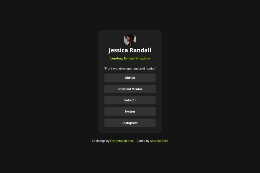
Design comparison
Solution retrospective
I implemented the :focus-visible pseudo-class to visually distinguish between hover and focus states:
&:focus-visible {
outline: 2px solid #{theme.color("accent")};
outline-offset: 2px;
}
Community feedback
- @StroudyPosted 2 months ago
Amazing job with this! You’re making fantastic progress. Here are some small tweaks that might take your solution to the next level…
- I would put these into a
<ul> <li>
, and the text should be wrapped with a<a>
so it is accessible with a keyboard using the tab key, Using an<a>
tag for navigation is semantically correct, improves accessibility for screen readers, and ensures consistent behavior across browsers, unlike a<button>
or a<div>
not intended for links.
<nav class="social__links"> <ul class="social__links--list"> <li class="social__links--list-item"> <a href="#" class="social__links--list-item--link">GitHub</a> </li> <li class="social__links--list-item"> <a href="#" class="social__links--list-item--link" >Frontend Mentor</a > </li> <li class="social__links--list-item"> <a href="#" class="social__links--list-item--link"> LinkedIn</a> </li> <li class="social__links--list-item"> <a href="#" class="social__links--list-item--link">Twitter</a> </li> <li class="social__links--list-item"> <a href="#" class="social__links--list-item--link">Instagram</a> </li> </ul> </nav>
-
This does not matter that much at this stage but something to be mindful of for SEO(Search Engine Optimisation),
<meta>
description tag missing that helps search engine determine what the page is about, Something like this<meta name="description" content="description goes here" />
-
Setting the
width
andheight
for an<img>
helps the page load faster and prevents content from jumping around as the image loads. This is good for performance and improves user experience. However, if your image needs to keep a consistent shape (aspect ratio) across different screen sizes, it's better to use the CSSaspect-ratio
property instead.
You’re doing fantastic! I hope these tips help you as you continue your coding journey. Stay curious and keep experimenting—every challenge is an opportunity to learn. Have fun, and keep coding with confidence! 🌟
0 - I would put these into a
Please log in to post a comment
Log in with GitHubJoin our Discord community
Join thousands of Frontend Mentor community members taking the challenges, sharing resources, helping each other, and chatting about all things front-end!
Join our Discord