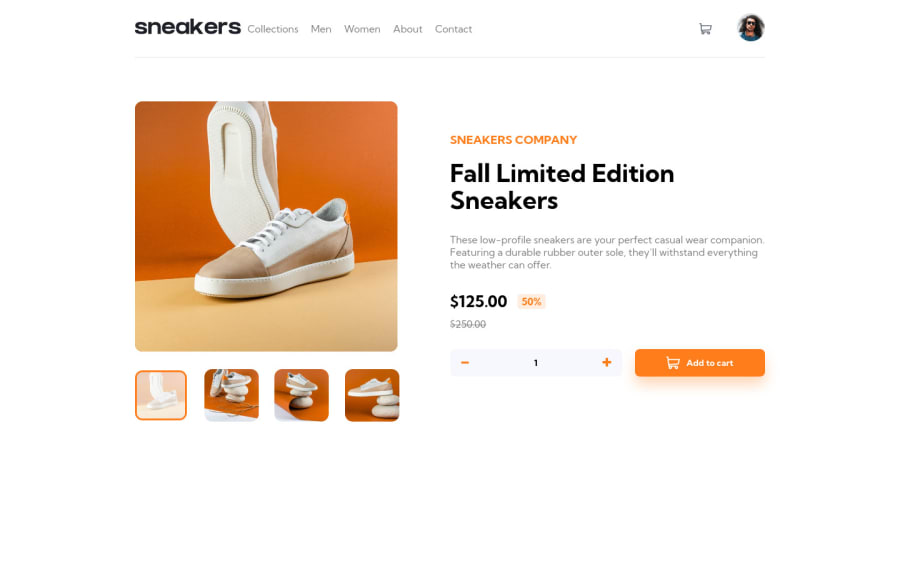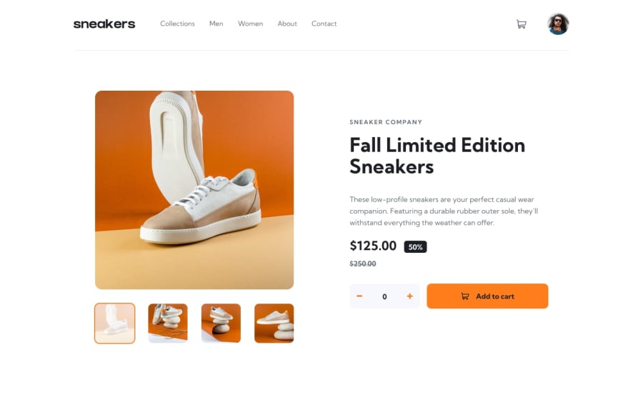
Design comparison
Solution retrospective
Hey there, Here is my solution for the product landing page. Please if you are interested in my experience reading my markdown.
Thanks for your everyone who wants to spend some time giving me some feedback.
Community feedback
- @skyv26Posted almost 3 years ago
There are some problems in mobile view
First your cart container is going outside the viewport when we click on cart button
Your Avatar seems bigger than rest of all components in header
In you desktop view
Navigational Arrow left and right are not aligned when we click on Sneeker main image
Cart total number of item is not visible which is requirements of this challenge
I would like to say 5/10 , but you can easily improve your design then it will be 9/10
0@kartardeveloperPosted almost 3 years ago@skyv26 After you open this for mobile design pls hard reload this page by pressing (Ctrl+Shift+R) because I include swiper library it takes time to set the slider. If any other issues then pls tell me. Thank You for your feedback.
0@skyv26Posted almost 3 years ago@kartarsohal Then it is clearly a bad user experience, See making a frontend means good user experience, if your webpage is not enough fast, then user will not come back to your website
Marked as helpful0
Please log in to post a comment
Log in with GitHubJoin our Discord community
Join thousands of Frontend Mentor community members taking the challenges, sharing resources, helping each other, and chatting about all things front-end!
Join our Discord
