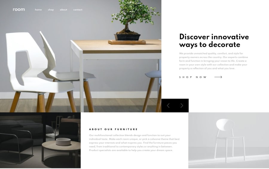
Design comparison
Solution retrospective
You can see the slider codes in the utils folder in GitHub repo. It is pretty easy with only JS and CSS.
Community feedback
- @ApplePieGiraffePosted over 4 years ago
Hey, good job on this challenge, Fatih! 👋
Your solution looks good and scales up/down very nicely! The transition between slides is nice, too! 👏
A super tiny suggestion might be to center the navigation links in the mobile navigation of the screen in the mobile layout of the site (since there's quite a bit of empty space to the left of the links before screen width gets very small). If you're up for it, a transition between the active/inactive states of the mobile nav would be cool, too! 😉
Keep coding (and happy coding, too)! 😁
Marked as helpful1 - @NDOY3M4NPosted over 4 years ago
Yay @fatihcaen congratulations on your implementation of the slider. It looks super smooth. One thing I might suggest is to add an
overflow: hiddenwhen the mobile navbar is open to prevent vertical scrolling.Happy coding :smile:
Marked as helpful1@fatihcandevPosted over 4 years ago@NDOY3M4N I didn't notice the scrolling. I'll take a look. Thanks for the heads up 👍
1 - @Mitko68Posted over 4 years ago
I am impressed with your solution. Still lots to learn from it. Very good approach and nice looking page!
1
Please log in to post a comment
Log in with GitHubJoin our Discord community
Join thousands of Frontend Mentor community members taking the challenges, sharing resources, helping each other, and chatting about all things front-end!
Join our Discord
