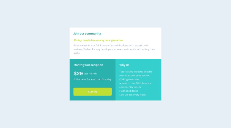
Design comparison
SolutionDesign
Solution retrospective
any suggestions on how to improve are welcome.
Community feedback
- @hitmorecodePosted over 1 year ago
Nice well done. Personally I would have done it a bit different (this doesn't mean that my way is the correct one)
I would have place the
min-height: 100vh;on the body and not on main. If later on you want to add more thing to the page, you'll do this on the body. So you would want the body to automatically grow with the content.body{ font-family: 'Karla', sans-serif; background: var(--neutral-light-gray); line-height: 1.5; min-height: 100vh; display: flex; justify-content: center; align-items: center; flex-direction: column; } main{ padding: 1.5rem; display: flex; justify-content: center; align-items: center; }0@iamcelestinoPosted over 1 year agoby your explanation you´re right, gotta make some changes. thank you man, appreciate..@hitmorecode
0
Please log in to post a comment
Log in with GitHubJoin our Discord community
Join thousands of Frontend Mentor community members taking the challenges, sharing resources, helping each other, and chatting about all things front-end!
Join our Discord
