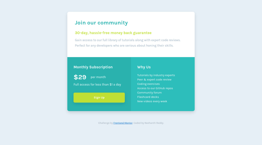
Design comparison
SolutionDesign
Solution retrospective
Updated solution
Community feedback
- @tedikoPosted almost 4 years ago
Hello, M. Neehanth Reddy! 👋
Good job, your solution looks good and responds well! I would suggest:
- Instead of using
gridjust on.subscription-boxi would consider set your.price-containerto be your grid container. This way if you ever want to change the arrangments of layout it would be simple and easy. Nevertheless, your solution is also good. - Read about semantic. Semantic elements lead to more consistent code, they are easier to read and improve accessibility.
- Try to stick more with design. I mean font-sizes in this case.
Good luck with that, have fun coding! 💪
1@neehanthreddy01Posted almost 4 years agoYeah sure, thank you very much @tediko
0 - Instead of using
- @ApplePieGiraffePosted almost 4 years ago
Hey, M. Neehanth Reddy! 👋
Nice job on this challenge! I think your solution looks good and scales well! 👍
Just one small suggestion—I think adding a hover state to the button would be a nice touch! 😉
Keep coding (and happy coding, too)! 😁
0@neehanthreddy01Posted almost 4 years ago@ApplePieGiraffe Yeah sure, thank you 😊
0
Please log in to post a comment
Log in with GitHubJoin our Discord community
Join thousands of Frontend Mentor community members taking the challenges, sharing resources, helping each other, and chatting about all things front-end!
Join our Discord
