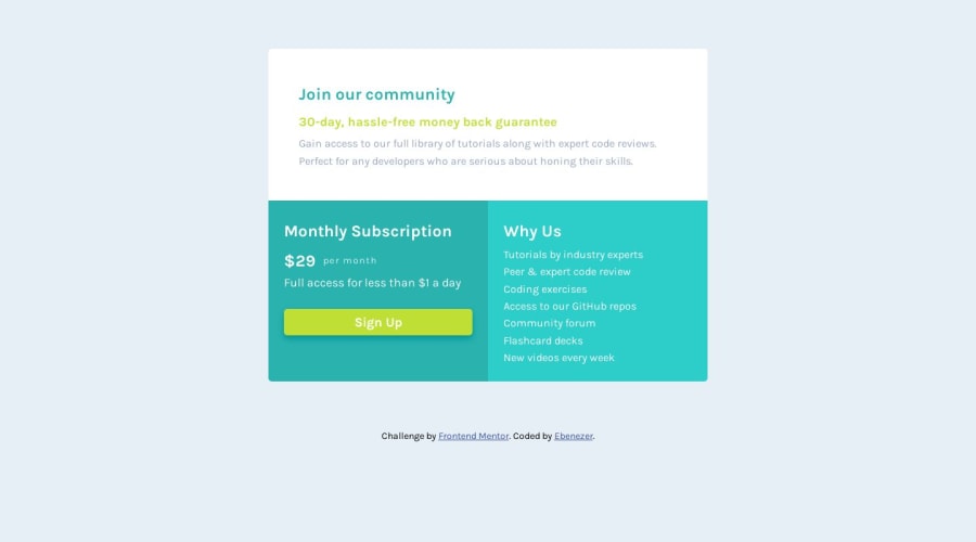
Design comparison
SolutionDesign
Community feedback
- @hitmorecodePosted about 1 year ago
Nice well done. Just a few thing you can fix
body {
    font-size: var(--fnt_size);
    font-family: var(--fnt_Karla);
    background-color: var(--light_gray);
/*     padding: 15vw 8vw; */ /* remove this line. it's not necessary. use flexbox instead to place the card in the middle of the page */
    min-height: 100vh; /* add these lines to place the card in the middle of the page */
    display: flex;
    justify-content: center;
    align-items: center;
    flex-direction: column;
}
Marked as helpful0
Please log in to post a comment
Log in with GitHubJoin our Discord community
Join thousands of Frontend Mentor community members taking the challenges, sharing resources, helping each other, and chatting about all things front-end!
Join our Discord
