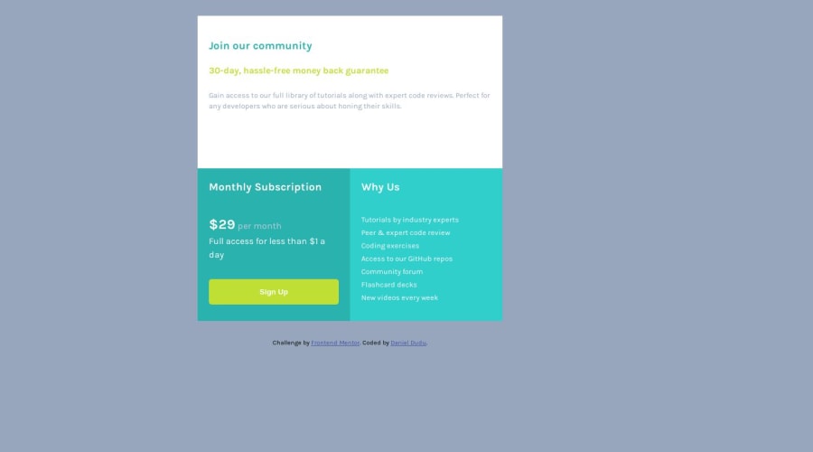
Design comparison
SolutionDesign
Solution retrospective
I really didn't find a solution to center perfectly the main container
Community feedback
- @rfilenkoPosted almost 5 years ago
Hey Daniel, no need to set width on a body. Background color seems a little different. Also adjust mobile look, looks good other than that. 🙂
Roman
1 - @danielduduPosted almost 5 years ago
Hey Roman, Thank you for your time and review!
I have eliminated the width on body and changed bg-color...maybe it is my screen that is not so great ...
Daniel
0
Please log in to post a comment
Log in with GitHubJoin our Discord community
Join thousands of Frontend Mentor community members taking the challenges, sharing resources, helping each other, and chatting about all things front-end!
Join our Discord
