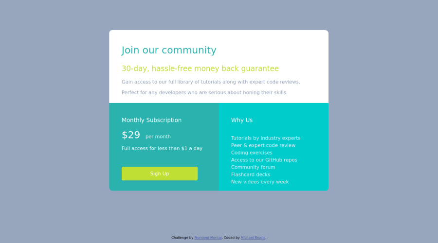


Design comparison

Solution retrospective
So this project felt a little more natural. Please check after me for errors, duplications, and excessiveness. Also when I look at site on mobile devices it doesn't shrink down, you have to scroll horizontally to view entire card. Please help and thank you!!
Community feedback
- @Cats-n-coffeePosted over 2 years ago
Hi Brodie!
Nice work! You solution isn't responsive for smaller devices because you hardcoded the
width. An easy way to make a card component responsive would be to give it amax-width: 700px(or whatever size/unit you want) andwidth: 100%. This will help keep your component below a max size while using 100% of the width. For this specific project, you would also need to adjust the layout since the mobile version is aligned as a column with one section below the other. Flexbox might be easier for the purpose of this project, but you can achieve this with Grid as well! Other feedback:- You seem to have forgotten the font, I'm not seeing it in the
headtag or in your CSS. - You can add a hover/focus state to your "Sign up" button and a
cursor: pointer, this helps the user seeing where the actions are on the page. - Good job picking appropriate tags overall on your HTML!
- Try to indent your code (HTML in this case), it makes it easier to read and remove unused code such as the
mainselector in your CSS (it's empty).
Good job! Hope this helps!
0@NeoAi12Posted over 2 years agoThis makes so much sense. I can go pinpoint this instructions. Thank you for taking time to inform me. The ideas for the sign up buttons are great. Definitely felt it was missing something!@Cats-n-coffee
0 - You seem to have forgotten the font, I'm not seeing it in the

Please log in to post a comment
Log in with GitHub
Join our Discord community
Join thousands of Frontend Mentor community members taking the challenges, sharing resources, helping each other, and chatting about all things front-end!
Join our Discord