Submitted almost 3 years ago
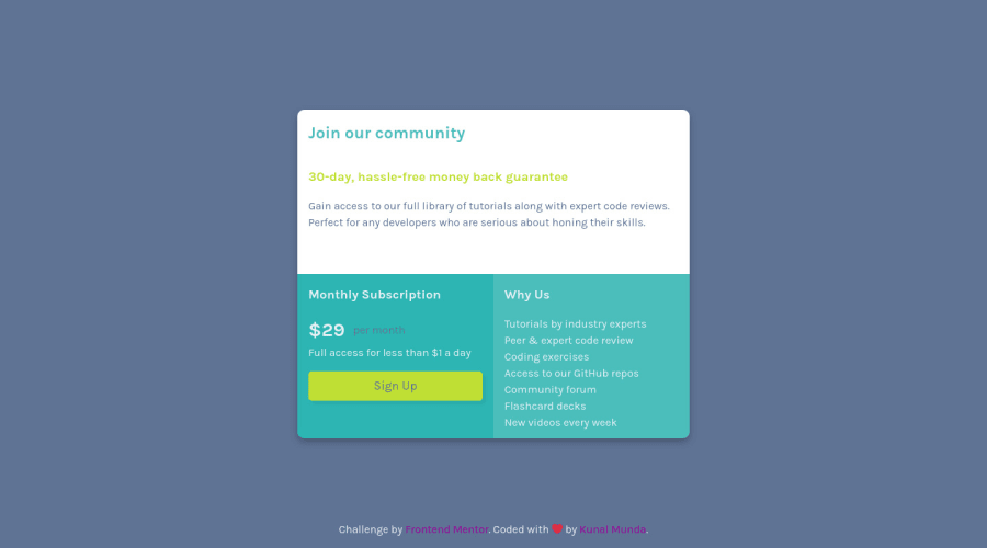
Single Price Component Using Grid and Flexbox
@ryu-kamiski
Design comparison
SolutionDesign
Solution retrospective
This is just the first try and will to more to improve it. Feedback are appreciated!😊
EDIT I uploaded it again and made it look this way. Suggestions and feedbacks are more than welcome!
Community feedback
- @anoshaahmedPosted almost 3 years ago
To get rid of the accessibility/HTML issues shown in your Report:
- wrap everything in your body in
<main>... OR use semantic tags ... OR giverole=""to the direct children of your<body>... Click here to read more - have at least one
<h1>in your code <section>and<article>usually need a heading; so if you don't need a heading in it, use some other element such as<div>
Read your Report for more information.
Great job! :)
Marked as helpful1 - wrap everything in your body in
- @Sam-GulikerPosted almost 3 years ago
Hi Kunal,
Almost there, check your landmarks. Try to use
<main class="main"></main>for example. Also check the sections, if they don't use headings. Maybe use a div or another element.Happy coding!
Marked as helpful1
Please log in to post a comment
Log in with GitHubJoin our Discord community
Join thousands of Frontend Mentor community members taking the challenges, sharing resources, helping each other, and chatting about all things front-end!
Join our Discord
