Design comparison
Solution retrospective
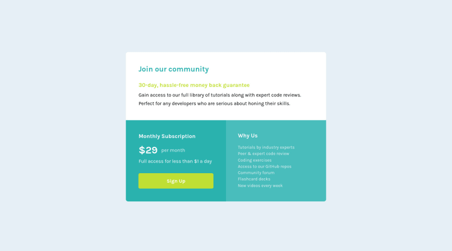
I am learning ReactJS, that's why I made it in react, I used styled-component to design and I made it responsive (Majority Support). I tried my best to make it look closer to design preview. Feedback regarding improvements will be appreciated.
Community feedback
- @MiculinoPosted almost 3 years ago
Good job on completing this challenge, Aakash!
I like how you structured your React app as it makes it easier to keep track of what's going on and it'll allow for further ease of scalability.
The App.css file is redundant since the elements targeted in that file don't exist anymore. You might want to either remove it or repurpose it to your app's needs.
Since you have an individual folder for each component, you could have the styled.js files inside them as well. In this case, the app's state doesn't exist, so you don't need any logic, but for example, you could have three files in the IntroSection folder: one for the structure, one for the logic, and another one for the styling.
The bem folder name is rather misleading since I thought it had to do with BEM classes. You could have a folder for global styles and another one for media queries, so you know where to look when coding.
Also, you might want to consider using variables to store color and size/space values. It'll make your code more maintainable and reusable.
You did a great job with the way you used relative units, that definitely is important when building responsive UIs.
Overall, your project is well done and I'm sure you've learned quite a lot about React with this project. I recommend finding a project that has a bit of logic for its state management so you can learn even more about React.
Keep up the good work, Aakash!
Marked as helpful2@skyv26Posted almost 3 years ago@Remus432 Hi! Thank you so much dude, Yup! I am learning react and needs some improvements to, I was using normal css and modular css and then I came across BEM and I didn't work on styled components 3 projects before. I understood your suggestion and next time I will structure my code as you suggested.
Yes! From past 2 days I am making plan to work on project that have more JS work, I already done my two challenges where I use state management hooks .
One of them is below Please also give feedback on ---> Click ME
Can you please elaborate more about BEM with a little example, I love to acquire knowledge. I am really happy that someone looked into my code at that much level . Love to hear from you on my next solution.
Thank you so so much
0@ogheneCodesPosted almost 3 years ago@skyv26 kudos to you. That you use React on this project shows you understand your craft. I will also pick up this challenge too but will stick to vanilla CSS for it. Weldon bro.
Marked as helpful1@ogheneCodesPosted almost 3 years ago@Remus432 awesome feedback....
Marked as helpful0 - @ryu-kamiskiPosted almost 3 years ago
woah! pixel perfect I say. Nicely done and if you do have time share your process briefly.
Marked as helpful1@skyv26Posted almost 3 years ago@ryu-kamiski Well I am sharpening my skills on HTML, CSS and working more JS in order to become JS Developer. This project can be made in 2 ways either use flexbox or use grid.
-
Grid makes your work easy as compared to flexbox, but I used flexbox, because I challenged myself to do it in flexbox only.
-
I would like to suggest PRACTICE! PRACTICE! and PRACTICE!
I am on slack, twitter . I like to help people and I can help you too by sharing knowledge ( with each other).
Best Wishes
1 -
- @brodiewebdtPosted almost 3 years ago
This looks very good. I would change the media-query to switch to desktop sooner. It switches to desktop at about 1350px, and the card is about 600px so you can lower it quite a bit. I would set it at 800-900px. If you change the Join or community text to an h1, it will clear the accessibility warning.
Hope this helps.
Marked as helpful1@skyv26Posted almost 3 years ago@brodiewebdt thank you David, i intentionally do this, actually now i want to move on next level challenge, only one newbie challenge is left. I will keep in mind and will do according to feedback.
2
Please log in to post a comment
Log in with GitHubJoin our Discord community
Join thousands of Frontend Mentor community members taking the challenges, sharing resources, helping each other, and chatting about all things front-end!
Join our Discord