

Design comparison

Community feedback
- @Youssef-fPosted 2 months ago
Hello there, your project look awesome! here is some review :
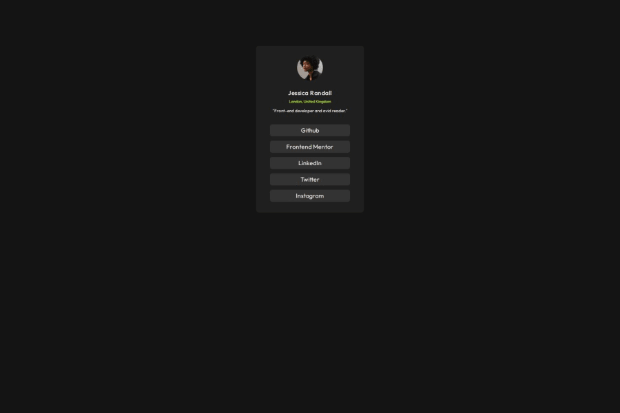
Strengths 1. Clean Structure: • The HTML structure is simple and well-organized with semantic elements like <div> for sections and meaningful class names. • The use of a separate CSS file (home.css) helps maintain a clean separation of concerns. 2. Styling Consistency: • The use of custom properties (--green, --grey900, etc.) for colors ensures consistency and makes it easier to update the theme later. • The consistent use of Flexbox provides a responsive and centered layout. 3. Typography: • The inclusion of the Google Font (Outfit) adds a polished look to the design. • Font sizes and weights are appropriately set for different text elements (e.g., name, city, and comment). 4. Hover Effects: • The hover effect on the social media links is intuitive and visually appealing, providing clear feedback to users. 5. Accessibility: • Including alt attributes in the <img> tags improves accessibility and SEO.
Areas for Improvement 1. Responsiveness: • While the layout works well for the given height (600px), it may not adapt seamlessly to smaller or larger screen sizes. Consider adding a media query to handle varying screen dimensions. 2. Image Optimization: • The width and height attributes of the image are hardcoded. Use responsive styles like max-width: 100% and height: auto to ensure the image scales properly across devices. 3. Interactive Elements: • The social media links are placeholders (href="#"). Adding real or placeholder URLs (e.g., href="https://github.com/") would improve realism and functionality. 4. Semantic HTML: • Replace the <div> container holding the social media links (<div class="mycon">) with a <nav> element to improve semantics for navigation. 5. Contrast Issues: • While the colors are visually appealing, consider checking their contrast ratio against accessibility standards (WCAG). The light green text on the dark background might not meet the required contrast ratio for some users. 6. CSS Optimization: • Avoid redundant code. For example, font-optical-sizing: auto; might not be necessary for this project. • Combine shared styles (e.g., justify-content: center; and align-items: center; used multiple times) into reusable classes to reduce duplication.
0 - P@okayishmaelPosted 2 months ago
It looks way smaller than the design. If you need reference, you can look at my source code. Don't specify any height on the profile container.
0


Please log in to post a comment
Log in with GitHubJoin our Discord community
Join thousands of Frontend Mentor community members taking the challenges, sharing resources, helping each other, and chatting about all things front-end!
Join our Discord