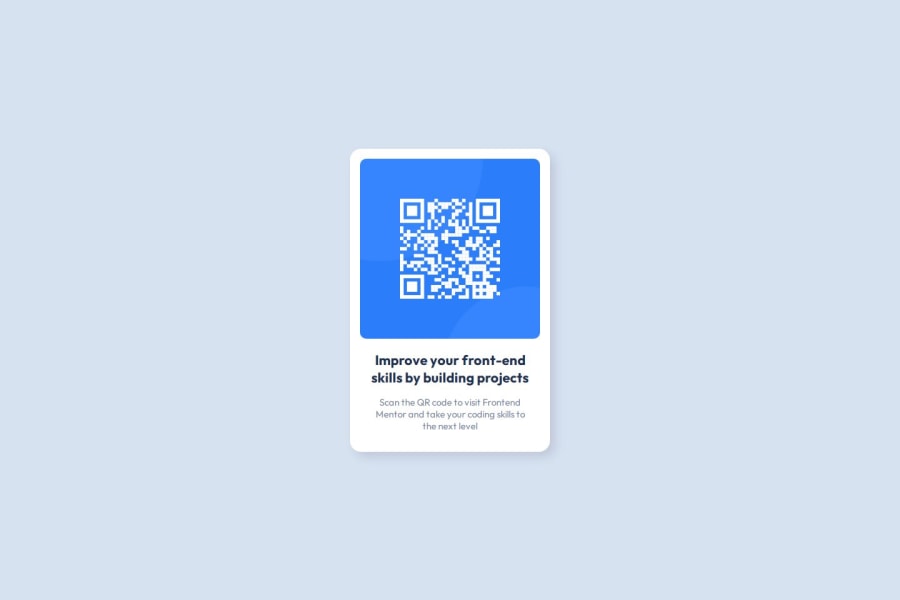
Design comparison
Community feedback
- @HassiaiPosted about 2 years ago
Give the alt attribute in the img a value. The value of the alt attribute is the description of the image. For decorative images like icons, there is no need to give it an alt value, for more on alt attribute Click here.
Replace <h2> with <h1> to fix the accessibility issue.
Every html must have <h1> to make it accessible. Always begin the heading of the html with <h1> tag wrap the sub-heading of <h1> in <h2> tag, wrap the sub-heading of <h2> in <h3> this continues until <h6>, never skip a level of a heading.
For a responsive content,
- Give .card a fixed max-width value and a padding value for all the sides
max-width: 320px which is 20rem/em padding:16px which is 1rem/em - Give the img a max-width of 100% and a border-radius value, the rest are not needed.
Give text-content a margin value for all the sides, text-align: center and a font-size of 15px which is 0.9375rem, this will be the font-size of both p and h1. Give p a margin-top or h1 a margin-bottom value for the space between the text.
To center .card on the page using flexbox or grid instead of position: absolute,
- USING FLEXBOX: add min-height:100vh; display: flex; align-items: center: justify-content: center; to the body
body{ min-height: 100vh; display: flex; align-items: center; justify-content: center; }- USING GRID: Add min-height:100vh; display: grid place-items: center to the body
body{
min-height: 100vh;
display: grid;
place-items: center;
}
Use relative units like rem or em as unit for the padding, margin, width values and preferably rem for the font-size values, instead of using px which is an absolute unit. For more on CSS units Click here
Hope am helpful.
Well done for completing this challenge. HAPPY CODING
Marked as helpful1@EvandeeMoSPosted about 2 years agoHi Hassia Issah, I've done some changes to my solution based on your suggestions. Your suggestions were very helpful to improve my knowledge of some topics and the page. I've mentioned you in my readme as a thank you for your contribution, I hope that you don't mind about it.
1 - Give .card a fixed max-width value and a padding value for all the sides
- @ecemgoPosted about 2 years ago
Some recommendations regarding your code that could be of interest to you.
In order to fix the accessibility issue:
- Each main content needs to start with an h1 element. Your accessibility report states page should contain a level-one heading. So, you need to use a
<h1>element in the<main>tag. You can replace your<h2 class="card-title">Improve your front-end skills by building projects</h2>element with the<h1 class="card-title">Improve your front-end skills by building projects</h1>element.
Hope I am helpful. :)
Marked as helpful1@EvandeeMoSPosted about 2 years agoHey Ecem Gokdogan, thank you for your suggestion. It really helped me to understand more about the heading levels and accessibility. I've mentioned you in my readme as a thank you for your contribution, I hope that you don't mind about it.
1@ecemgoPosted about 2 years ago@EvandeeMoS that's very kind of you to mention me at the readme, thank you for it and I'm happy to be able to help. :)
0 - Each main content needs to start with an h1 element. Your accessibility report states page should contain a level-one heading. So, you need to use a
- @sumanth-chandanaPosted about 2 years ago
Hi Evandee!, congrats🎉 on completing the challenge. Better take care about following points.
- Always check Frontendmentor Report Generator issues after submitting the project for removing errors and warnings.
- Use the
alt(alternate text) attribute as mentioned in your Accessibility Report.altattribute is used for Screen readers applications. - Why does alt attribute matter? Read here.
- To avoid accessibility issues "All page content should be contained by landmarks" use code as :
 <body>
    <main>
        ---your code here----
    </main>
  <footer>
  </footer>
</body>
(why does
<main>matter? Read here )- For proper centering the container(whole card) vertically and horizontally you can also use the following simple block of code use code:
body { min-height: 100vh; display: grid; place-content: center; }- When we open the GitHub repository link, you will find an About Section on the right side. There, also include a live preview link of your project. It is better for someone to check your live project while interacting with code.
I hope you will find this Feedback Helpful.
Marked as helpful1@EvandeeMoSPosted about 2 years agoHi Sumanth Chandana, thank you for your comment! You helped me to understand a little more about how frontend mentor works and gave me some very useful suggestions for my code. I've mentioned you in my readme as a thank you for your contribution, I hope that you don't mind about it.
1
Please log in to post a comment
Log in with GitHubJoin our Discord community
Join thousands of Frontend Mentor community members taking the challenges, sharing resources, helping each other, and chatting about all things front-end!
Join our Discord
